

Fluid Base gives every Divi project a stronger start:
A clean, fluid design foundation that adapts to every screen size, with practical fixes already in place. You spend less time rebuilding the basics and more time creating a polished, consistent design.

|

|

Fluid Base for Divi
Fluid Base in a Nutshell
Note: When you activate the video, YouTube will be loaded in privacy-enhanced mode. By activating it, you agree to YouTube’s Privacy Policy.
The idea is simple: Fluid Base automatically applies fluid typography, spacing and layout widths across your Divi site, all based on shared values that you can manage and adjust in one place. Change a value once, and every connected module updates with it.
“But doesn’t Divi 5 already have variables?” Yes, and Fluid Base uses that built-in system. But creating variables is only the first step. You still have to apply them to the right fields in the Visual Builder, module by module. Fluid Base takes care of that manual work for you.
“And what about Divi 4?” Fluid Base adds this functionality where it isn’t available natively. You get the same benefits without having to put it all together through manual CSS hacks.
Useful Divi fixes, reusable presets and support for WooCommerce and Contact Form 7 are built in.
Everything works with Divi 4 and 5, inside your familiar Divi workflow.
The Responsive Design System for Divi 4 & 5
Fluid Base for Divi Features
1. Fluid design, automatically applied
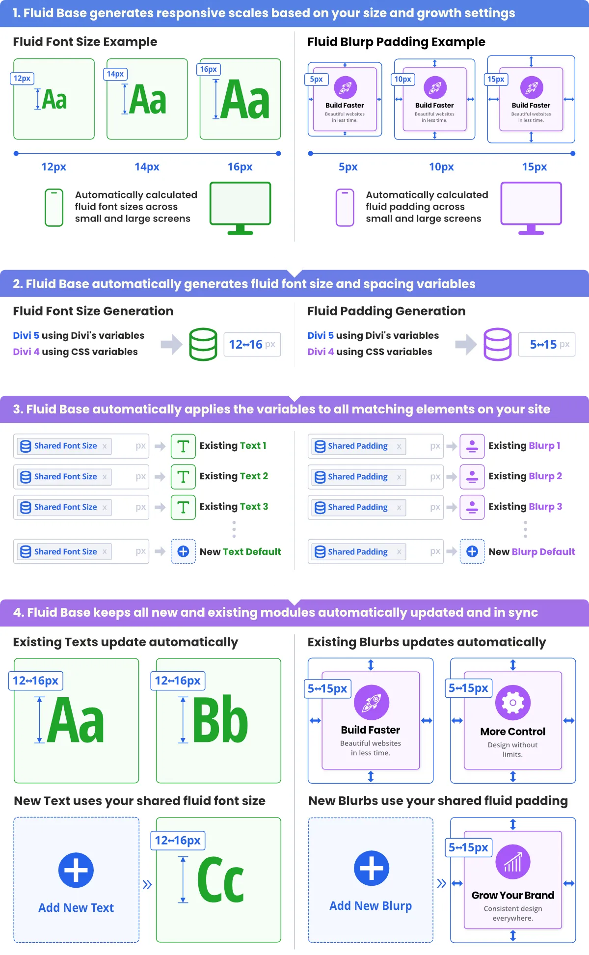
Fluid Base generates fluid font sizes and spacing and applies them to Divi modules, Sections and Rows. Text and spacing scale smoothly across screen sizes, so you no longer enter tablet and phone values field by field. Adjust the values to match your design. Less time typing the same numbers, more time actually designing.
2. Balanced layouts across screen sizes
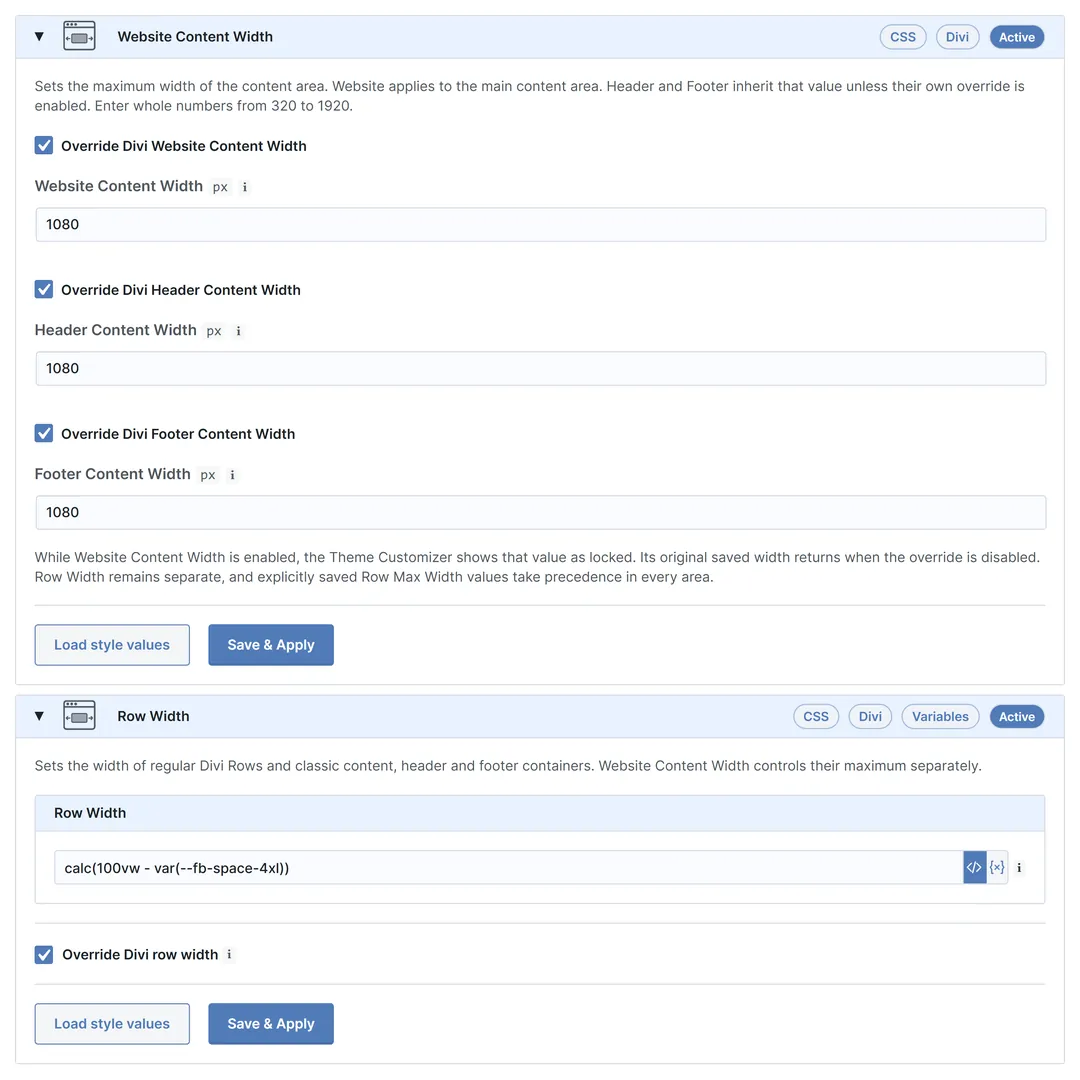
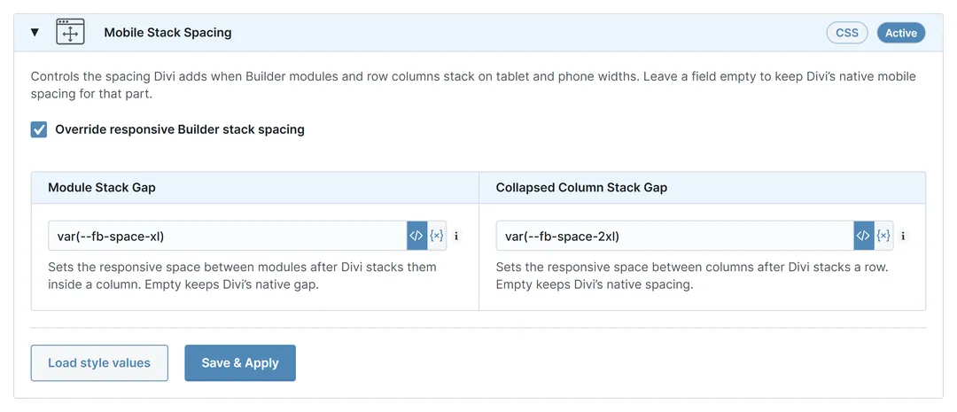
Give your content room to breathe, from phone to desktop. Set content, header and footer widths centrally and define the gaps between columns and modules when they stack on smaller screens. Do this once for the whole website, so layouts keep consistent proportions from page to page. Stacked content no longer sticks together on mobile.
3. Change it once, keep your exceptions
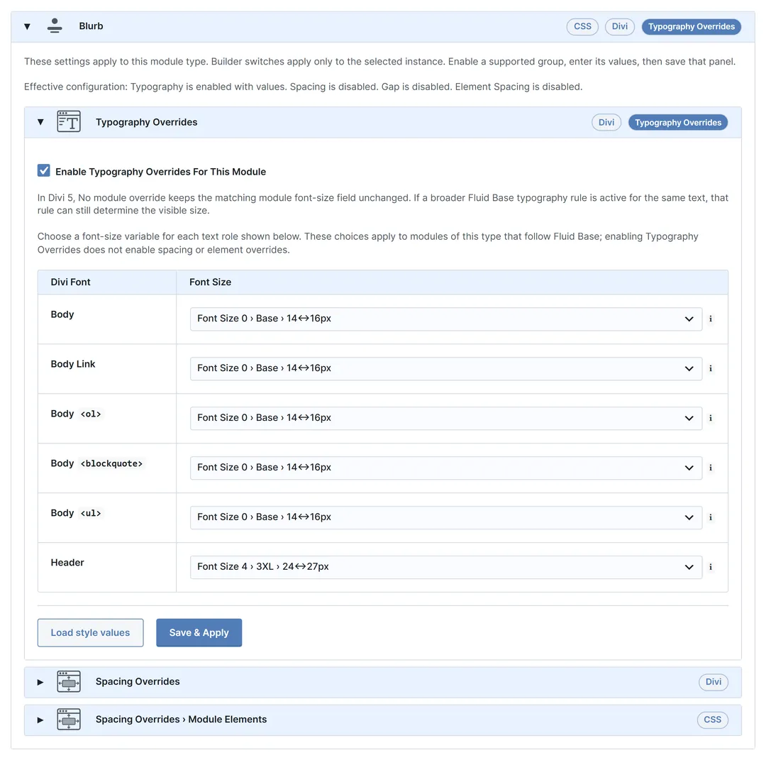
Change a shared value once and every connected module follows. Set typography, spacing and other module details centrally, then fine-tune a module type where your design needs something different. Single modules can still keep their own settings. The design stays consistent without editing the same settings module by module, and your exceptions stay where you put them.
4. Practical Divi fixes built in
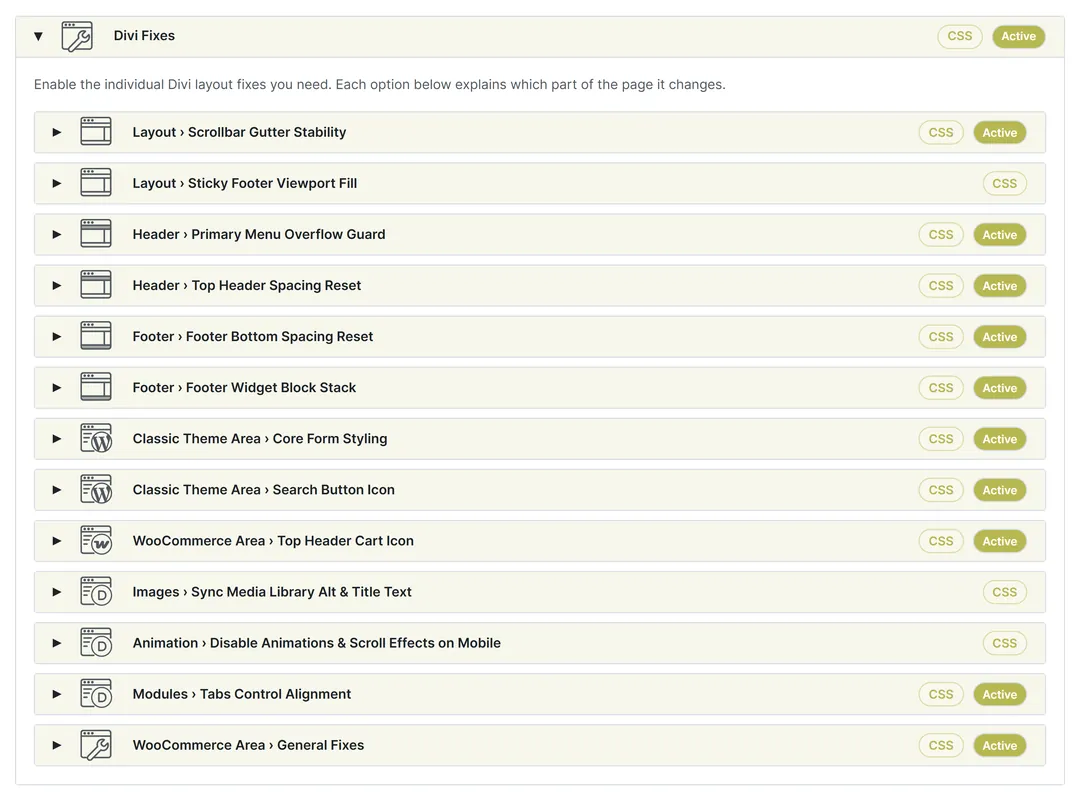
Spend less time working around Divi’s everyday quirks. Fluid Base keeps classic primary menus from overflowing, footers at the bottom of short pages and tab labels centered. Frontend images can also use the latest alt and title text from the Media Library. Switch on only the fixes your website needs and leave the rest off.
5. Consistency beyond the Builder
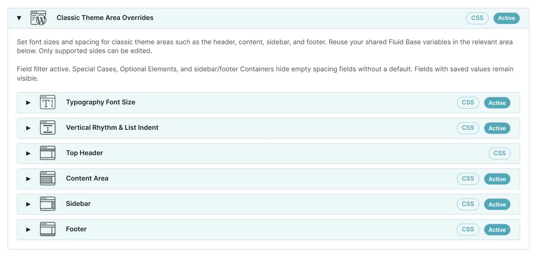
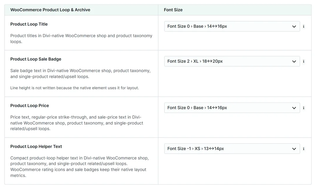
Fluid typography and spacing don’t stop at the Builder. Fluid Base also covers your blog content, sidebars, widgets and native forms, with support for WooCommerce and Contact Form 7. The same settings keep these areas in line with your design, so a blog post or product page no longer looks borrowed from another website.
6. A head start for every project
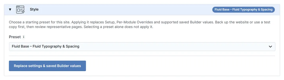
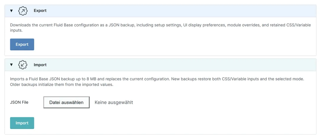
Start your next project with the basics already in place. Choose a ready-made preset and adjust it to the design. Export your finished setup and import it on other client websites, so the work behind it pays off more than once. Each site still gets its own design, but the responsive foundation no longer starts from scratch.
7. Find and set fonts faster
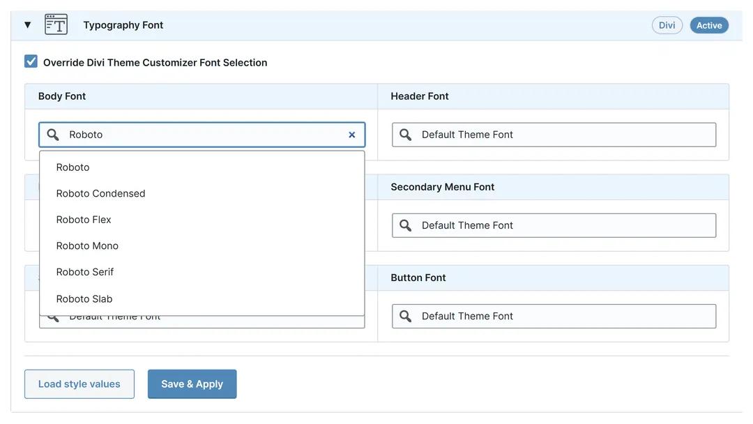
Find the font you want by typing its name. Fluid Base searches Divi’s font library, including fonts you uploaded to Divi yourself. Then set the fonts for body text, headings, menus and buttons in one place. Changing the heading font later is just as quick. Choosing a font really should not be a scrolling exercise.
8. Fluid design without the extra weight

Fluid typography and spacing should not come with a pile of extra CSS. On Divi 5, Fluid Base uses Divi’s native variables. On Divi 4, it outputs CSS for the features you have switched on and the content it finds on each page. Prepared styles are cached and reused instead of being rebuilt each time.
Fluid Base for Divi
Tutorial Videos
You are currently viewing a placeholder content from Default. To access the actual content, click the button below. Please note that doing so will share data with third-party providers.
More InformationFluid Base for Divi