Fluid Base for Divi
Fluid Base gives every Divi project a stronger start: a clean, fluid design foundation with responsive typography, spacing, layout widths, and practical fixes already in place. You spend less time rebuilding the basics and more time creating a polished, consistent design.

Fluid Base for Divi
Features

Automatic Fluid Design Foundation For Divi
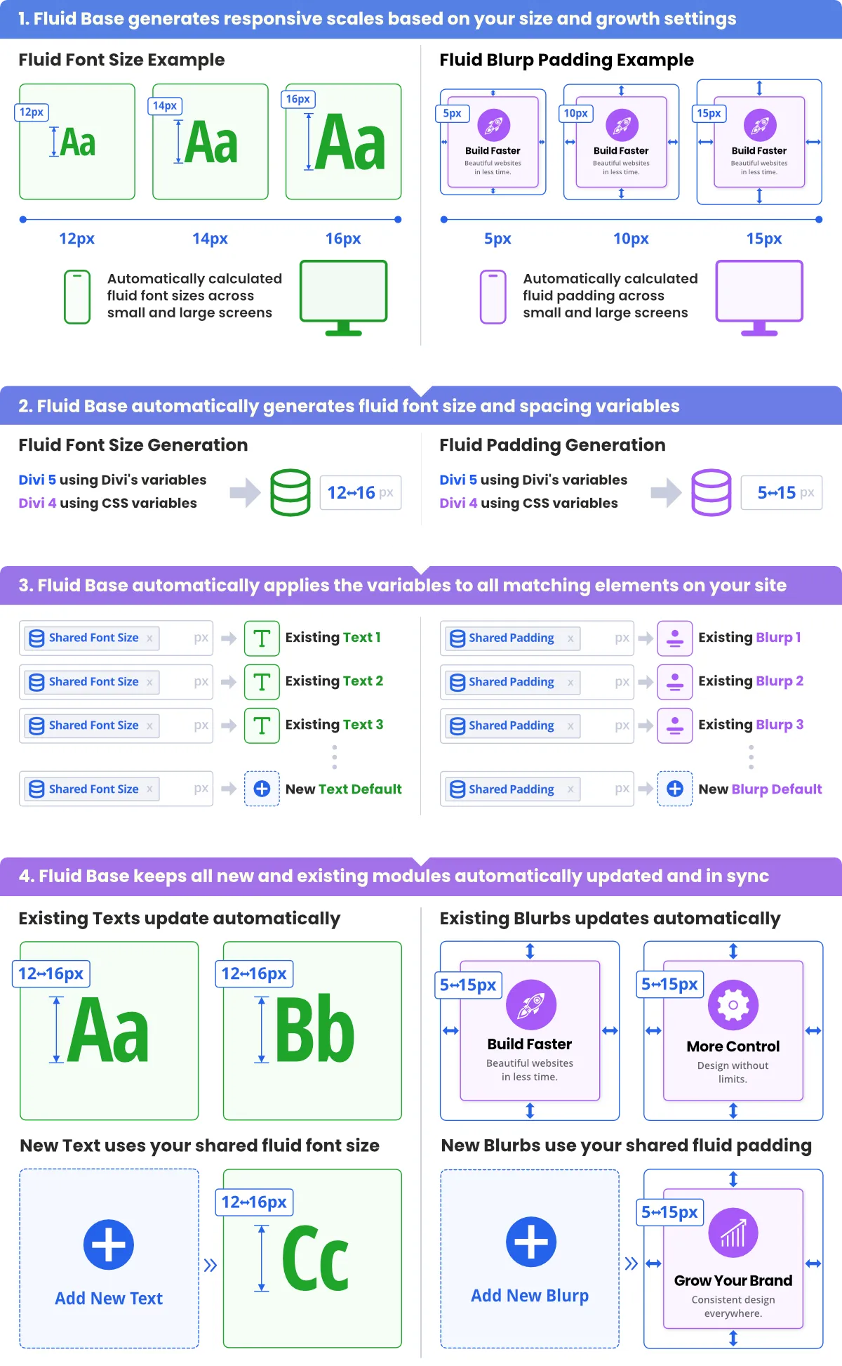
Fluid Base creates a complete fluid design system for Divi and applies it across the relevant areas of a website. Typography, spacing, vertical rhythm, Section and Row rhythm, Row width, module defaults, menus, WooCommerce, Contact Form 7, classic WordPress areas, and supported Divi contexts can all follow the same responsive foundation.
Instead of fixing layouts module by module and breakpoint by breakpoint, Fluid Base turns a few core design values into a proportional system that scales smoothly across screen sizes. This gives Divi projects a stronger starting point, reduces repetitive setup work, and helps prevent inconsistent one-off values across the site.

Built For The Divi Workflow
Fluid Base fits into the familiar Divi workflow instead of forcing a separate way of working. The Visual Builder remains the central working environment, while Fluid Base handles the repetitive responsive groundwork in the background.
This is a major advantage for real Divi projects: designers can keep building the way they already work, while Fluid Base handles the responsive foundation for fluid typography, spacing, rhythm, Row width, module defaults, and full-site consistency.
When a specific module, Section, Row, page, or layout area needs a deliberate exception, local Divi values can still be used. The workflow stays familiar and flexible, but starts from a stronger responsive foundation.
In practice, this means fewer repetitive setup steps, fewer breakpoint corrections, and more time for the actual design work.

Generated Values, Automatically Applied
Fluid Base does not only generate fluid font-size and spacing values. It maps them to the relevant Divi areas and applies them where they belong.
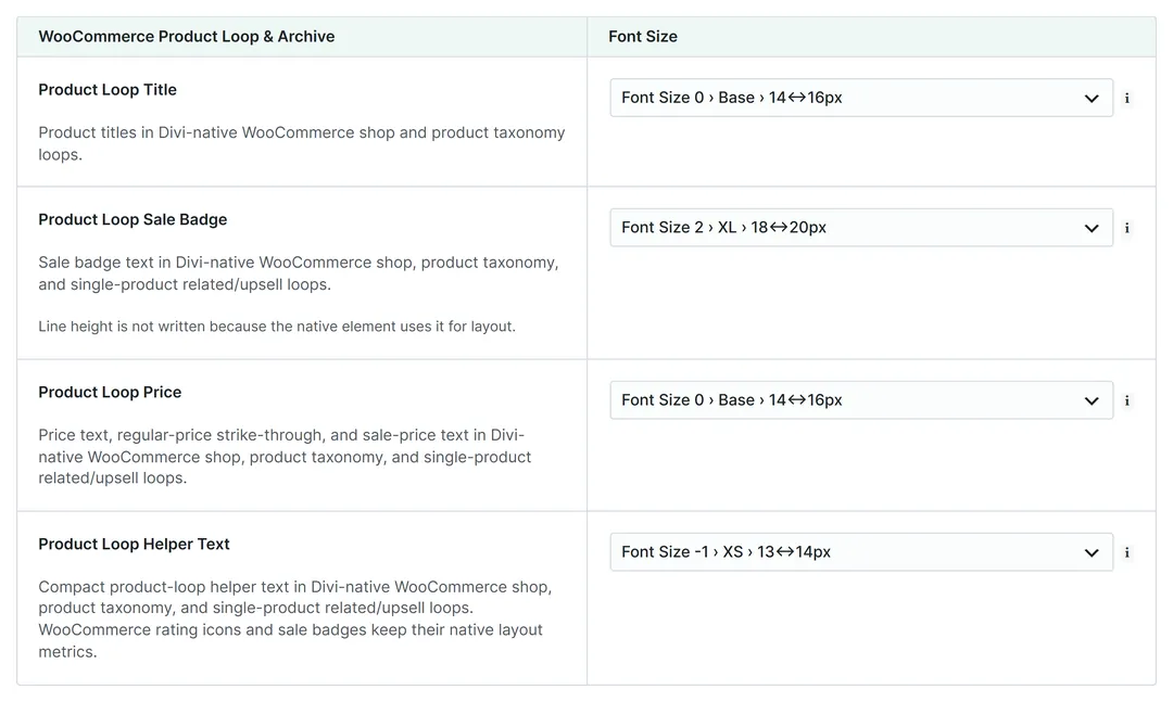
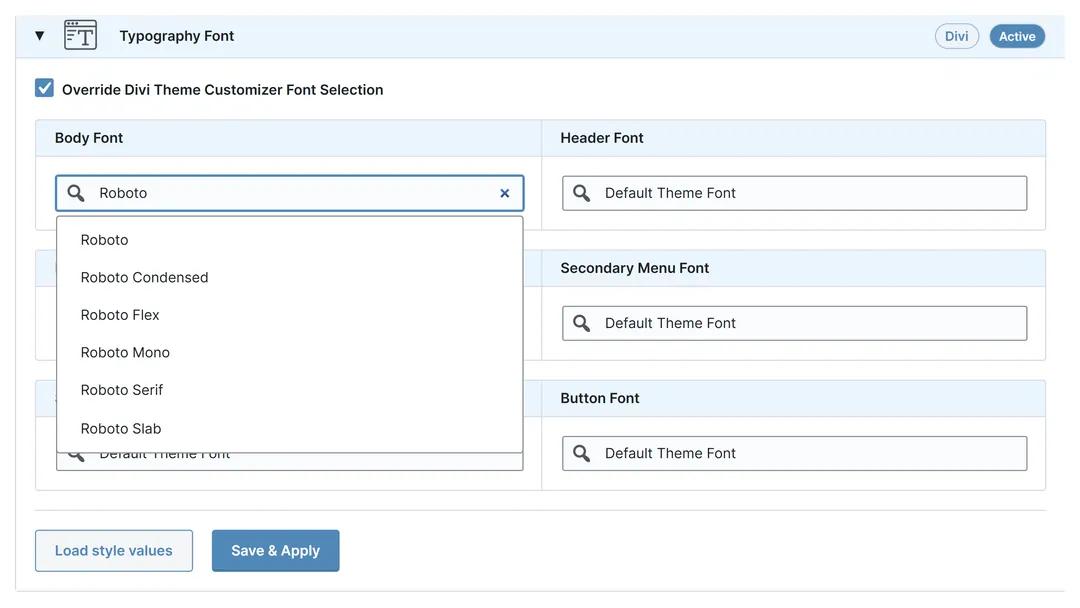
Instead of manually selecting variables field by field in the Visual Builder, Fluid Base can automatically connect supported modules, typography settings, layout contexts, Sections, Rows, menus, WooCommerce modules, Contact Form 7 outputs, and classic WordPress areas to the same fluid design foundation.
This turns generated values into a usable design system for the entire Divi project instead of leaving them as another manual setup task.

Responsive Beyond The Divi Builder
Fluid Base is not limited to typical Divi Builder sections. It can also bring the same fluid typography, spacing, and layout logic to areas that often sit outside the Visual Builder or are not rebuilt with the Divi Theme Builder.
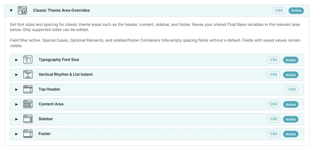
This includes menus, classic WordPress content, sidebars, footer widgets, login areas, 404 pages, search results, and other classic theme outputs. For existing client websites, hybrid Divi setups, and older WordPress structures, this helps the full website feel responsive and consistent - not just the Builder layouts.
That makes Fluid Base especially valuable for real-world Divi projects where not every part of a site has been rebuilt perfectly with the Theme Builder.

Works With WooCommerce, Contact Form 7 And Most Divi Extensions
Fluid Base supports all native Divi modules - including the latest Divi 5 additions like Instagram Feed and Table of Contents - and extends the same fluid foundation to WooCommerce, Contact Form 7, classic WordPress areas, and most Divi extension setups.
Not every third-party Divi extension can be tested individually, but Fluid Base follows Divi’s normal module and Builder patterns and is designed for broad compatibility with popular extensions such as Divi Pixel and similar tools.
Per-module Fluid Base overrides are not available for non-native third-party modules. In Divi 5 especially, Fluid Base variables can still be used flexibly with other extensions, keeping extended websites aligned with the same fluid typography and spacing system.

Fluid Typography, Spacing And Layout Rhythm
Fluid Base creates responsive type and spacing scales that adapt smoothly between small and large screens. Headings, body text, lists, menu text, module text, and classic content areas can scale fluidly between defined minimum and maximum values.
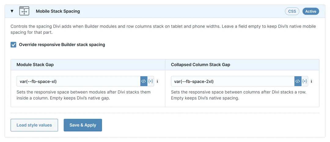
The same proportional logic applies to spacing and rhythm. Paragraph spacing, Section padding, Row padding, vertical rhythm, and common module spacing can scale together instead of being corrected manually for every breakpoint.
This helps solve common Divi issues such as typography that feels too large on mobile, too small on desktop, uneven Section spacing, inconsistent Row padding, and layouts that need constant manual responsive cleanup.

Section And Row Height, Width And Module Defaults
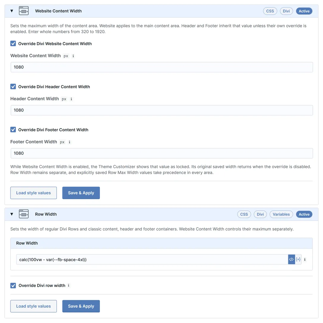
Sections and Rows define the structure and visual pace of a Divi layout. Fluid Base helps control Section and Row height rhythm, Row padding, shared Row width, and classic container width through the same design system.
Row width can follow responsive spacing logic, helping content areas stay balanced across mobile, tablet, laptop, and large desktop layouts. This gives Divi projects a more intentional layout structure without manually tuning every page from scratch.
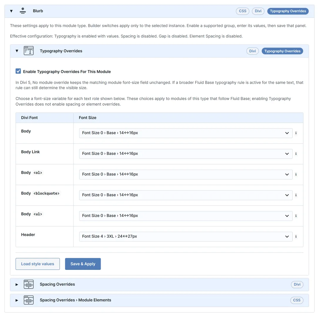
Fluid Base also provides useful module defaults, helping common Divi modules start from a cleaner responsive baseline. Typography, spacing, lists, buttons, forms, and layout details can stay closer to the same design foundation from the beginning.

Control Where The System Applies
Auto-apply controls make it possible to choose where the generated variables should be used across typography, spacing, Section and Row rhythm, Row width, content areas, sidebars, footer widget areas, supported modules, and classic WordPress outputs.
This makes Fluid Base flexible for both clean new builds and existing client websites. A project can follow one shared responsive foundation where consistency matters, while specific areas can stay untouched, be fine-tuned, or use their own local Divi values when the layout requires it.
Auto-applied values can also be overwritten locally whenever a module, Section, Row, page, or layout area needs a deliberate exception.

One-Click Starting Point And Reusable Presets
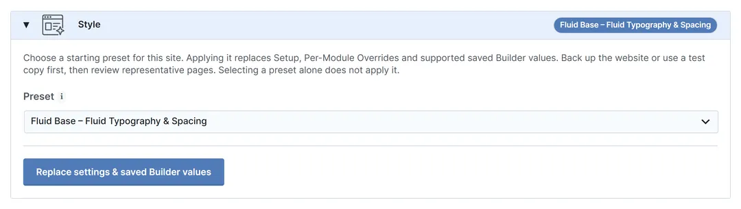
The default Fluid Base preset gives new projects an immediate responsive foundation with fluid typography, balanced spacing, Section and Row rhythm, Row width, and useful module defaults.
Instead of rebuilding the same responsive setup before every project, designers can start from a structured baseline and fine-tune only where the project actually needs it. This helps new Divi builds move faster from technical setup to real design work.
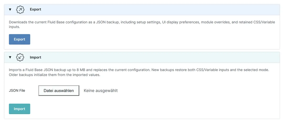
Fluid Base settings and presets can also be exported and imported with a few clicks. This is useful for recurring project structures, agency workflows, starter setups, and consistent Divi systems across multiple client sites.

Divi 5 Native, Divi 4 Optimized
In Divi 5, Fluid Base uses Divi’s native variable system. Fluid font-size and spacing values are created as Divi variables and applied directly inside the Divi workflow. This keeps the system clean, modern, and highly performant because Fluid Base uses Divi’s native variable workflow and keeps the usual Builder workflow intact.
In Divi 4, Fluid Base brings the same design logic through optimized CSS output. Since Divi 4 cannot use Divi 5’s native variable system, CSS generation is especially important.
CSS output is based on active feature groups, relevant page contexts, and detected content. Prepared styles can be cached and reused, helping Divi 4 projects benefit from a fluid system without unnecessary site-wide CSS bloat.

Performance-Focused Output
Fluid Base is built to keep the frontend lean. In Divi 5, fluid values use Divi’s native variable system, so the responsive foundation is delivered through Divi’s native variable workflow instead of a broad extra CSS layer.
For Divi 4, Fluid Base uses optimized CSS generation with active feature detection, page context awareness, content detection, and cached prepared styles. Output stays focused on what each page actually needs.
The result is a fluid design system without unnecessary global overhead: responsive typography, spacing, layout rhythm, menus, widgets, and classic areas stay aligned while the generated output remains targeted, efficient, and practical for real Divi websites and client projects.

Practical Divi Fixes For Real Projects
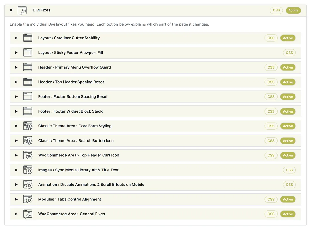
Fluid Base includes focused Divi fixes for classic theme areas and frontend details that often need manual cleanup in real projects. These fixes help menus, layout behavior, headers, footers, forms, search areas, and text flow stay more aligned with the same fluid system.
-
Typography - Orphan Text
Improves frontend text wrapping so very short final words are less likely to stand alone on a new line. This helps text blocks look more polished and balanced across responsive layouts.
-
Layout - Scrollbar Gutter Stability
Reserves the browser scrollbar gutter so centered Divi layouts keep the same horizontal position when moving between short pages without a scrollbar and long pages with a scrollbar. This helps prevent small but visible layout jumps between pages.
-
Layout - Sticky Footer Viewport Fill
Lets the main content area fill the browser viewport on short pages so the footer reaches the bottom edge instead of leaving empty body space below it. This keeps short pages visually cleaner and more intentional.
-
Header - Primary Menu Overflow Guard
Helps keep long desktop primary menus, search, and cart controls inside Divi’s configured header height. Fluid Base can reduce horizontal menu spacing first, hide Search when space is tight, and use Divi’s mobile menu before menu items overlap the logo or page content.
-
Header - Top Header Spacing Reset
Normalizes the classic top-header row so contact items, menus, and social icons sit on one cleaner horizontal bar. Optional controls can match the Footer Bottom height model on desktop, align social icons to the right, and define block gaps or icon spacing.
-
Footer - Footer Bottom Spacing Reset
Normalizes the classic Footer Bottom row so credits and social icons sit on one cleaner horizontal bar. Controls for block gaps and icon spacing help the footer feel more balanced, including stacked mobile footer layouts.
-
Footer - Footer Widget Block Stack
Keeps footer widgets on a predictable vertical stack so classic widgets, block widgets, and widget headings feel more consistent with the Fluid Base spacing and typography system. This helps classic footer widget areas look cleaner without rebuilding them from scratch.
-
Classic Theme Area - Core Form Styling
Adds Divi-like field and button styling to native frontend WordPress/Core forms in content, sidebar, footer-widget, search, password, login, and classic comment areas. WooCommerce forms, the WordPress admin, standalone wp-login.php, native Divi modules, and Builder editing are not changed.
-
Classic Theme Area - Search Button Icon
Uses a search icon instead of visible Search text on native Classic Theme Area search submit controls. When inactive, Fluid Base leaves the original Search text unchanged.
Fluid Base for Divi