User Manual
Use this guide both as a setup reference and as a product walkthrough. If you already use Fluid Base, it shows where each control lives and what it changes. If you are evaluating the plugin, it shows how Fluid Base reduces breakpoint fixes, one-off module values, inconsistent spacing, and manual CSS work while keeping the normal Divi workflow intact.
User Manual
What Fluid Base Solves
Divi gives designers a flexible visual builder, but responsive consistency still often requires repeated manual work: adjusting text sizes across breakpoints, correcting section spacing, keeping rows aligned, tuning mobile stacks, styling classic WordPress areas, and making WooCommerce or form elements feel like part of the same design system.
Fluid Base handles that foundation layer. A few core settings generate a proportional system for typography, spacing, vertical rhythm, section and row rhythm, and row width. The plugin can then apply that system across supported Divi areas automatically, so the website starts from a consistent responsive baseline instead of a collection of disconnected local values.
- Fluid typography and spacing that scale between defined viewport widths.
- Shared rhythm for paragraphs, headings, lists, sections, rows, and modules.
- Automatic application to supported Divi Builder settings and saved content.
- Support for classic WordPress areas that often sit outside Theme Builder layouts.
- WooCommerce and Contact Form 7 areas that can follow the same visual foundation.
- Local exceptions remain possible when a specific module, section, row, or page needs its own values.
User Manual
Installation, Activation & First Review
Installation
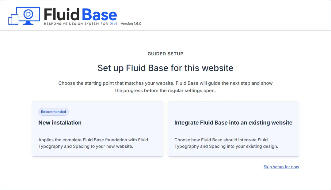
Before installing Fluid Base, make sure Divi 4 or Divi 5 is the active theme. Fluid Base is designed to work with the Divi workflow, not replace it. The Visual Builder remains the place where pages are designed; Fluid Base provides the responsive foundation underneath.
Install the plugin from Plugins > Add New Plugin > Upload Plugin in WordPress, choose the Fluid Base ZIP file, click Install Now, and activate the plugin after the upload finishes.
Fluid Base is easiest to evaluate on a fresh Divi site because the foundation becomes visible immediately. Existing Divi sites should test it on staging first. During activation, Fluid Base stores a snapshot of the Divi values it controls before applying its own settings. This makes it possible to review the result carefully and decide whether to keep, adjust, or restore the controlled values later.
Activation
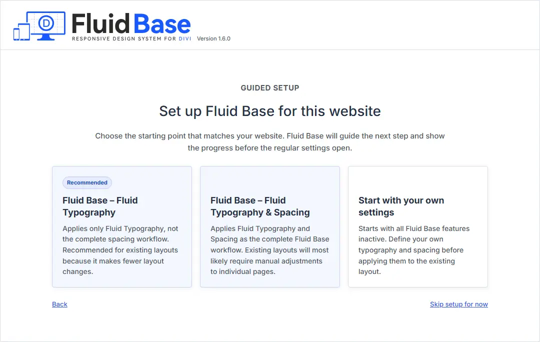
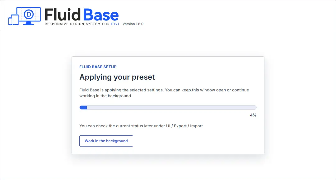
When Fluid Base is activated, it applies the selected foundation preset and saves the Divi values it controls. This backup is important for existing projects because Fluid Base may replace specific controlled typography, spacing, row, section, and Builder values with its own responsive system.
For new projects, activation gives the site an immediate fluid baseline. For existing projects, activation should be treated as a structured review step: check important templates, repeated modules, product pages, forms, menus, blog layouts, and classic WordPress areas before rolling the setup into production.
Deactivation / Cleanup
When Fluid Base is deactivated from the Plugins screen, the dialog offers two options.
Restore Everything restores Fluid-Base-controlled Builder fields and backed-up Divi values where Fluid Base has a recorded value. Use this when you want to return controlled settings closer to the state before Fluid Base was activated. Be aware that later manual edits inside those controlled fields can be overwritten.
Deactivate Only keeps Fluid Base settings, Divi variables, and Builder values in place, but stops Fluid Base CSS from being generated while the plugin is inactive. This can be useful for temporary troubleshooting, but the website may not look correct if active Fluid Base output is required for the current design.
Recommended Workflow
For most sites, the default Fluid Base preset is the intended starting point. Activate it, review the most important layouts, and only adjust settings when the site needs a different visual density, width, or rhythm.
Use this workflow:
- Start with the foundation. Review Setup › Fluid Font Size & Spacing first. These controls define the responsive range, body text, heading scale, spacing tokens, vertical rhythm, section and row rhythm, and row width.
- Evaluate the site as a system, not module by module. Check whether the whole site feels too tight, too spacious, too narrow, too wide, or visually inconsistent across screen sizes.
- Tune global scale before local values. If desktop text feels too small, adjust fluid growth. If mobile spacing feels good but large screens need more breathing room, adjust spacing growth. Avoid correcting every module separately when the foundation can solve the issue.
- Bring non-Builder areas into the same system. Use Divi Builder Area Overrides, Classic Theme Area Overrides, WooCommerce Area Overrides, and Contact Form 7 support where menus, widgets, sidebars, product areas, forms, or classic content should follow the same responsive foundation.
- Use Per-Module Overrides for repeated patterns. When all modules of one type should share a typography, spacing, layout gap, or element spacing default, configure that module family once instead of correcting each instance.
- Use local exceptions deliberately. If a single module, section, row, or page needs its own Divi values, use the Fluid Base Builder control to opt that item out of the matching shared group. Exceptions should be intentional, not the default workflow.
The goal is not to remove design control. The goal is to make the responsive baseline consistent first, so individual design decisions can be made on purpose.
User Manual
Frequently Asked Questions
The questions below answer the practical setup decisions most users face first: changing body text, heading scale, site density, section rhythm, row width, mobile stack spacing, typography in non-Builder areas, and repeated module defaults.
If you are still evaluating Fluid Base, this section is also a quick way to understand the core product logic: instead of fixing every breakpoint and module manually, Fluid Base lets you adjust the underlying system that those areas can share.
User Manual
Setup Page

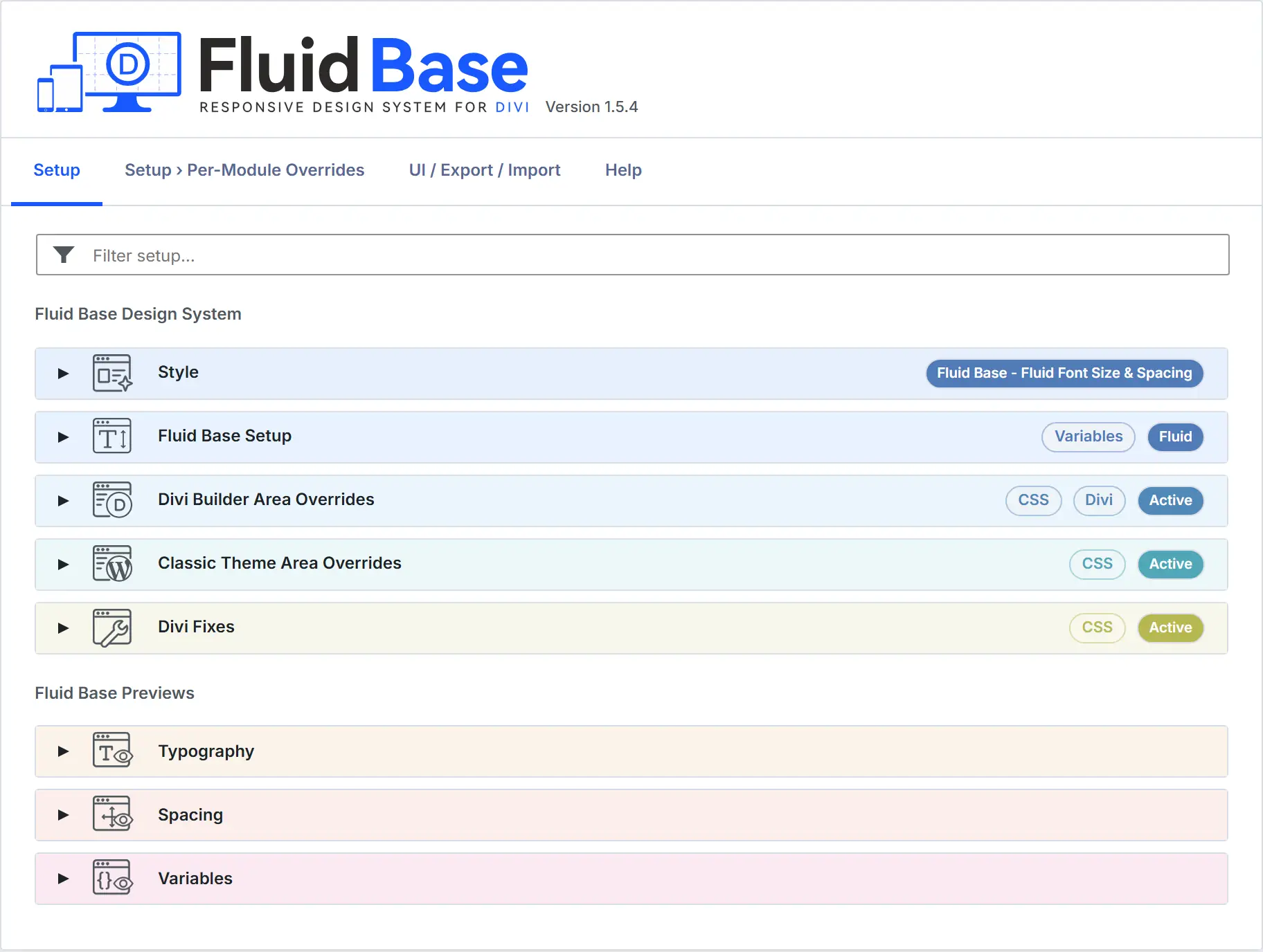
Setup is the foundation layer of Fluid Base. Changes here affect the global responsive scale, spacing tokens, section and row rhythm, row width, and the shared variables other areas can consume. Use this page when the whole site should feel more compact, more spacious, wider, narrower, or more proportionally balanced across screen sizes.
The shipped Fluid Base preset turns static Divi decisions into one fluid system. Typography, spacing tokens, and row width have separate controls, while vertical rhythm, list indentation, and layout rhythm consume the shared variables where appropriate.
Style

| Element | What It Controls |
|---|---|
| Preset | Chooses the starting model for this site. The preset decides which Fluid Base typography, spacing, fix, and module values are restored by Reset to default and by individual card resets. Save applies the selected foundation to the Fluid Base Admin settings. Save and apply to all pages also writes it into supported saved Builder content across the site. Values managed by Fluid Base are replaced there, including later manual field changes and Fluid Base Builder modal changes. It is the project foundation, not a Divi preset that must be assigned manually to every module. |
Fluid Font Size & Spacing

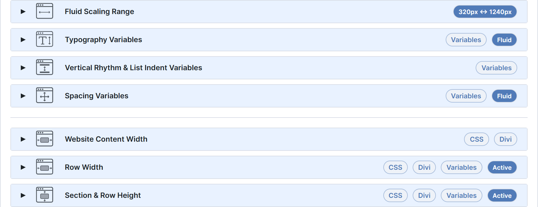
Fluid Scaling Range
| Element | What It Controls |
|---|---|
Minimum width px |
Defines the viewport where the fluid scale starts. Below this width, Fluid Base keeps typography and spacing at their compact small-screen values so mobile layouts do not keep shrinking. |
Maximum width px |
Defines the viewport where the fluid scale reaches its largest values. Wider screens keep that maximum, so desktop layouts stay controlled instead of growing forever. |
Typography
Body
| Element | What It Controls |
|---|---|
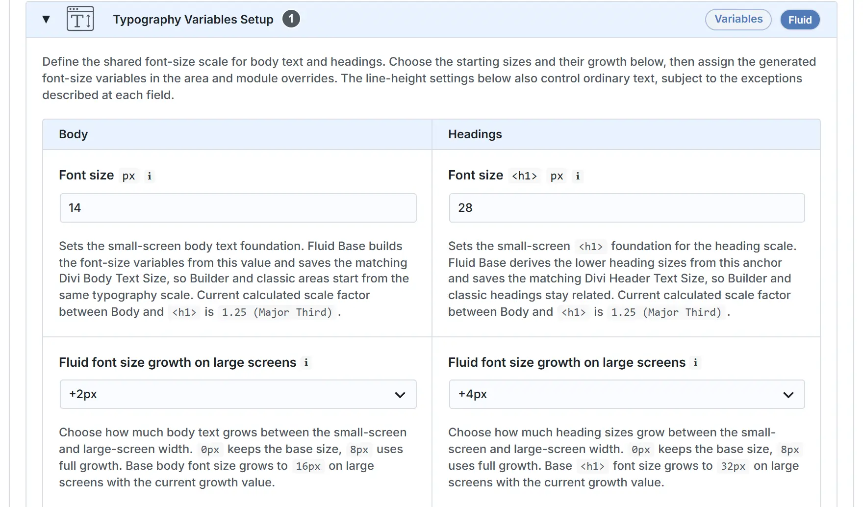
| Font size | Sets the small-screen body-text foundation for the shared Fluid Base font-size variables. Spacing tokens have their own scale in the Spacing Variables panel, so typography and layout rhythm can be tuned independently.
Technical Reference:
|
| Fluid font size growth on large screens | Controls how much normal text grows between the minimum and maximum viewport widths. Use it to make desktop text more spacious while keeping mobile text compact. The same growth model feeds the shared font-size variable family. |
| Line height | Sets the vertical reading rhythm for normal text. The value stays unitless so it follows the active font size and matches Divi’s Theme Customizer line-height behavior.
Technical Reference:
|
| Text scale curve | Controls how small helper text, meta text, labels, and compact supporting variables step down from normal body text. Higher values keep small text more readable; lower values create a stronger contrast between body copy and supporting text. |
Headings
| Element | What It Controls |
|---|---|
Font size <h1> |
Sets the small-screen heading foundation for the shared Fluid Base heading variables. Fluid Base builds the heading variable family from this <h1> size, so page titles and lower headings keep a predictable relationship across Builder, Classic, and Woo areas.
Technical Reference:
|
| Fluid font size growth on large screens | Controls how much headings grow across the viewport range. This is the main lever for making desktop headings feel more generous while keeping small screens from becoming oversized. |
| Line height | Sets the vertical rhythm for headings. The value stays unitless so it follows the active heading size and matches Divi’s Theme Customizer line-height behavior.
Technical Reference:
|
| Text scale curve | Shapes <h2> to <h6> between Body and <h1>. 1.0 follows the displayed scale factor evenly; higher values keep lower headings closer to body text and make the top headings stand out more. |
Vertical Rhythm & List Indent
| Element | What It Controls |
|---|---|
| Paragraph after spacing | Sets the vertical rhythm after paragraphs so text blocks scale consistently with the fluid spacing system. Controls the listed content rhythm value for the matching heading or text-flow role. |
| List block after spacing | Sets the spacing after a complete unordered or ordered list before the next content block begins. Controls the listed content rhythm value for the matching heading or text-flow role. |
| List item after spacing | Controls the spacing between list items so lists stay tighter than normal paragraph flow. Controls the listed content rhythm value for the matching heading or text-flow role. |
| List indent | Defines the left padding for normal unordered and ordered lists. Frontend output keeps a safe minimum inset for visible native markers so markers cannot protrude past the content edge. Controls the paired top/bottom or left/right values for this content rhythm setting. |
| List marker gap | Controls the padding between list markers and list item text for unordered and ordered lists. Controls the paired top/bottom or left/right values for this content rhythm setting. |
| Nested list spacing | Controls the top and bottom spacing around nested lists so sub-items stay visually connected to their parent item. Controls the paired top/bottom or left/right values for this content rhythm setting. |
| Nested list item after spacing | Controls the spacing between nested list items separately from the root list rhythm. Controls the listed content rhythm value for the matching heading or text-flow role. |
| Nested list indent | Sets the inset for nested lists so second-level list content aligns cleanly within the fluid typography rhythm. Controls the paired top/bottom or left/right values for this content rhythm setting. |
| Definition list after spacing | Sets the spacing after a definition list before normal content flow continues. Controls the listed content rhythm value for the matching heading or text-flow role. |
| Definition description indent | Sets the inset for definition descriptions so each description stays grouped with its term. Controls the listed content rhythm value for the matching heading or text-flow role. |
| Definition description after spacing | Sets the spacing after each definition description so term and description pairs stay readable. Controls the listed content rhythm value for the matching heading or text-flow role. |
| Preformatted block after spacing | Sets the spacing after preformatted and code blocks within shared content flow. Controls the listed content rhythm value for the matching heading or text-flow role. |
| Preformatted block padding | Controls the native inset inside preformatted blocks. Controls the paired top/bottom or left/right values for this content rhythm setting. |
| Blockquote spacing | Sets the top and bottom spacing around blockquotes so quoted content stands apart from normal paragraphs. Controls the paired top/bottom or left/right values for this content rhythm setting. |
| Blockquote inline inset | Sets the inline inset for blockquotes so the quote body is clearly separated from normal body copy. Controls the listed content rhythm value for the matching heading or text-flow role. |
| Table spacing | Sets the top and bottom spacing around tables so they read as distinct content blocks. Controls the paired top/bottom or left/right values for this content rhythm setting. |
| Table header cell spacing | Sets the inside spacing for all four sides of table header cells. Controls the paired top/bottom or left/right values for this content rhythm setting. |
| Table body cell spacing | Sets the inside spacing for all four sides of table body cells. Controls the paired top/bottom or left/right values for this content rhythm setting. |
| Heading spacing | Sets the space above a content heading and between the heading and the text that follows it. Controls the paired top/bottom or left/right values for this content rhythm setting. |
Spacing Variables
| Element | What It Controls |
|---|---|
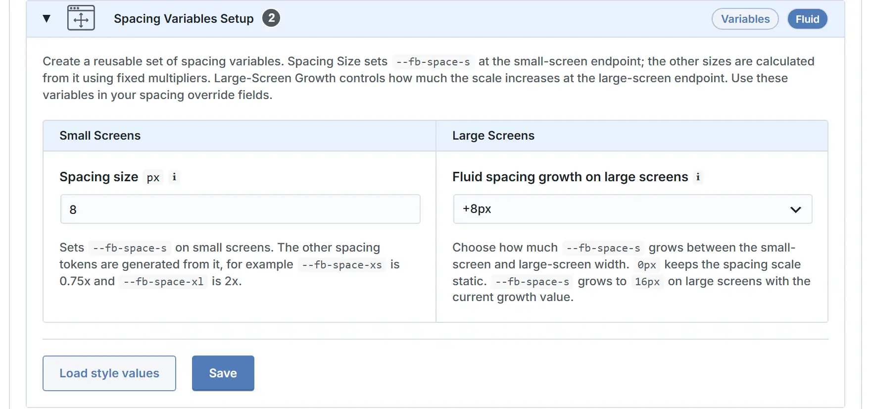
Spacing size px |
Sets the small-screen value for --fb-space-s. All other spacing tokens are generated from fixed multipliers, for example --fb-space-xs is 0.75x and --fb-space-xl is 2x. |
| Fluid spacing growth on large screens | Adds responsive desktop growth to --fb-space-s. The large-screen endpoint is spacing size plus this growth value, and the Spacing Preview shows fixed Small Screens and Large Screens token values with matching boxes. |
Section & Row Height
| Element | What It Controls |
|---|---|
| Override Divi section and row height | Controls whether Fluid Base overrides Divi’s legacy Section and Row Height Theme Customizer values across desktop, tablet, and phone. This is the master switch in “Setup › Fluid Font Size & Spacing › Section & Row Height”. When active, Fluid Base sets section_padding, tablet_section_height, phone_section_height, row_padding, tablet_row_height, and phone_row_height to 0. When inactive, Divi’s original Section and Row behavior applies and the Auto-Apply settings have no effect. |
| Section height / padding variable | Sets the shared Section padding rhythm that Builder Sections and classic Section-equivalent areas can use. Shows --fb-section-height as the central Section rhythm reference used by Auto-Apply and generated output. |
| Row height / padding variable | Sets the shared Row padding rhythm that Builder Rows and row-like classic areas can use. Shows --fb-row-height as the central Row rhythm reference used by Auto-Apply and generated output. |
| Auto-apply to all Section and Row modules | Applies the central Section and Row height variables to Section and Row module padding. When active together with the master switch, Section and Row module Spacing Overrides are treated as active for UI and output. The module Spacing toggle and affected padding fields are locked. |
| Auto-apply to Classic Theme Area › Content Area | Applies the central Section and Row height variables to the Classic content shell and content column. When active together with the master switch, affected Content Area spacing fields are locked for display and output only. |
| Auto-apply to Classic Theme Area › Sidebar | Applies the central Section and Row height variables to Classic sidebar spacing. When active together with the master switch, affected Sidebar spacing fields use the combined Section and Row value because a single field represents both levels. |
| Auto-apply to Classic Theme Area › Footer Widget Area | Applies the central Row height variable to the Classic footer widget area. When active together with the master switch, only the footer widget-area padding is locked for display and output. Footer navigation and footer bottom-bar padding stay independent. |
Row Width
| Element | What It Controls |
|---|---|
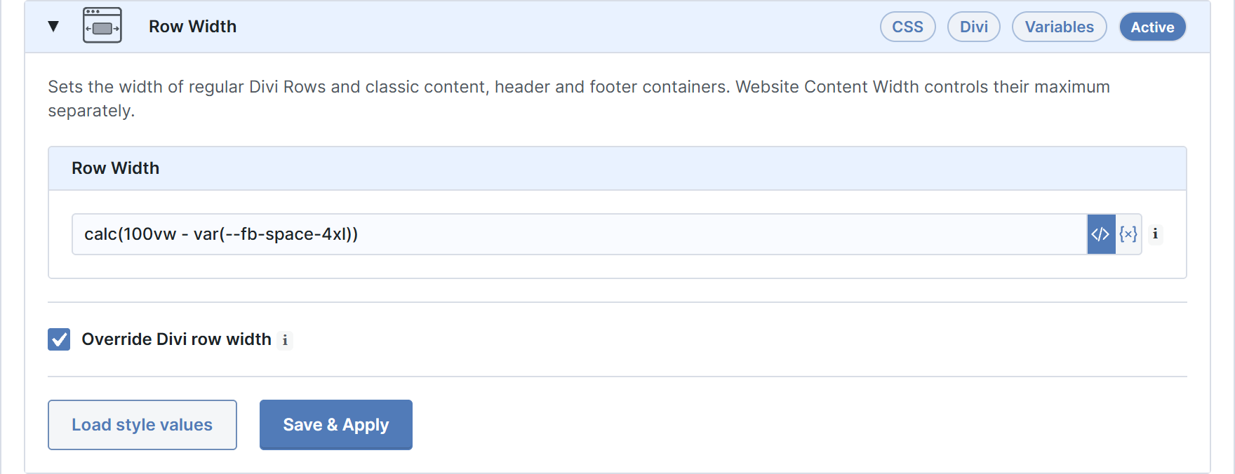
| Row width variable | Sets the shared row and classic container width reference. Writes --fb-row-width. The field accepts a CSS width value such as 80%, calc(100% - 4rem), min(90%, 1200px), clamp(72%, 80vw, 90%), or var(--my-row-width). |
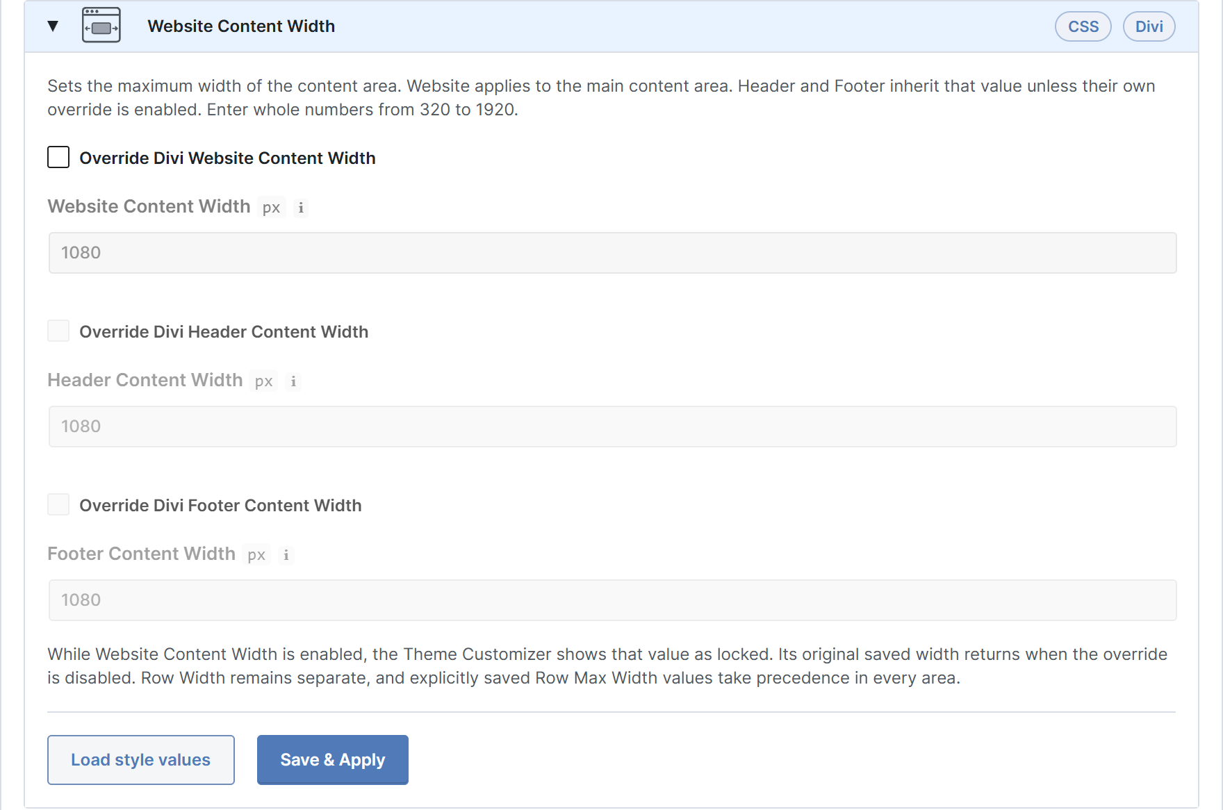
| Override Divi row width | Controls whether Fluid Base applies the row-width variable to Divi’s global row/container width output. This is the master switch in “Setup › Fluid Font Size & Spacing › Row Width”. When active, Divi 5 receives --content-width: var(--fb-row-width), Divi 4 Builder rows receive width: var(--fb-row-width), and scoped classic content/footer containers receive the same width. Individual Row module width settings remain untouched. |
| Website Content Width separation | Keeps Divi’s pixel max-width cap separate from the row percentage width. Divi Website Content Width / content_width controls the max-width cap such as 1080px. Row Width controls the separate 80%-style width path and does not write Theme Customizer options. |
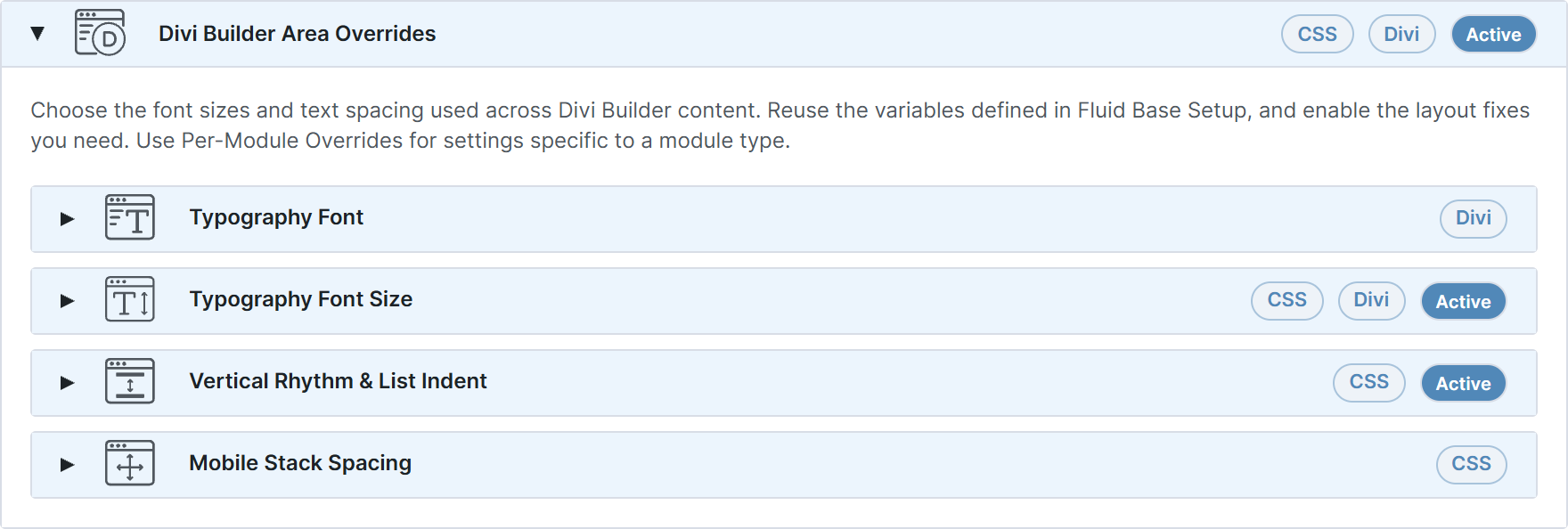
Divi Builder Area Overrides
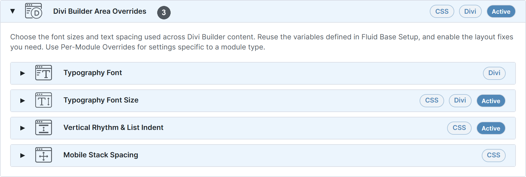
These settings connect Divi Builder-related typography and spacing roles to the Fluid Base foundation. Use them when Builder output should follow the same type scale and rhythm without manually assigning values field by field.

Typography
| Element | What It Controls |
|---|---|
| General Settings › Typography › Body Text Size | Connects the General Settings › Typography › Body Text Size role to the shared Fluid Base text typography scale for Divi Theme Area text.
Technical Reference:
|
| General Settings › Typography › Header Text Size | Connects the General Settings › Typography › Header Text Size role to the shared Fluid Base text typography scale for Divi Theme Area text.
Technical Reference:
|
| Header & Navigation › Primary Menu Bar › Text Size | Connects the Header & Navigation › Primary Menu Bar › Text Size role to the shared Fluid Base text typography scale for Divi Theme Area text.
Technical Reference:
|
| Header & Navigation › Secondary Menu Bar › Text Size | Connects the Header & Navigation › Secondary Menu Bar › Text Size role to the shared Fluid Base text typography scale for Divi Theme Area text.
Technical Reference:
|
| Header & Navigation › Slide In / Fullscreen Menu › Slide In Menu Text Size | Connects the Header & Navigation › Slide In / Fullscreen Menu › Slide In Menu Text Size role to the shared Fluid Base text typography scale for Divi Theme Area text.
Technical Reference:
|
| Header & Navigation › Slide In / Fullscreen Menu › Slide In Top Bar Text Size | Connects the Header & Navigation › Slide In / Fullscreen Menu › Slide In Top Bar Text Size role to the shared Fluid Base text typography scale for Divi Theme Area text.
Technical Reference:
|
| Header & Navigation › Slide In / Fullscreen Menu › Fullscreen Menu Text Size | Connects the Header & Navigation › Slide In / Fullscreen Menu › Fullscreen Menu Text Size role to the shared Fluid Base text typography scale for Divi Theme Area text.
Technical Reference:
|
| Header & Navigation › Slide In / Fullscreen Menu › Fullscreen Top Bar Text Size | Connects the Header & Navigation › Slide In / Fullscreen Menu › Fullscreen Top Bar Text Size role to the shared Fluid Base text typography scale for Divi Theme Area text.
Technical Reference:
|
| Header & Navigation › Fixed Navigation Settings › Text Size | Connects the Header & Navigation › Fixed Navigation Settings › Text Size role to the shared Fluid Base text typography scale for Divi Theme Area text.
Technical Reference:
|
| Footer › Footer Widgets › Header Text Size | Connects the Footer › Footer Widgets › Header Text Size role to the shared Fluid Base text typography scale for Divi Theme Area text.
Technical Reference:
|
| Footer › Footer Widgets › Body/Link Text | Connects the Footer › Footer Widgets › Body/Link Text role to the shared Fluid Base text typography scale for Divi Theme Area text.
Technical Reference:
|
| Footer › Footer Menu › Font Size | Connects the Footer › Footer Menu › Font Size role to the shared Fluid Base text typography scale for Divi Theme Area text.
Technical Reference:
|
| Footer › Bottom Bar › Font Size | Connects the Footer › Bottom Bar › Font Size role to the shared Fluid Base text typography scale for Divi Theme Area text.
Technical Reference:
|
| Buttons › Text Size | Connects the Buttons › Text Size role to the shared Fluid Base text typography scale for Divi Theme Area text.
Technical Reference:
|
| Blog › Post › Meta Text | Connects the Blog › Post › Meta Text role to the shared Fluid Base text typography scale for Divi Theme Area text.
Technical Reference:
|
| Blog › Single Post › Header Text | Connects the Blog › Single Post › Header Text role to the shared Fluid Base text typography scale for Divi Theme Area text.
Technical Reference:
|
Vertical Rhythm & List Indent
Use this panel to make paragraph, heading, list, quote, and table spacing inside Divi Builder text areas follow the shared vertical rhythm.
| Element | What It Controls |
|---|---|
| Paragraph after spacing | Sets the vertical rhythm after paragraphs so text blocks scale consistently with the fluid spacing system. Controls the listed content rhythm value for the matching heading or text-flow role. |
| List block after spacing | Sets the spacing after a complete unordered or ordered list before the next content block begins. Controls the listed content rhythm value for the matching heading or text-flow role. |
| List item after spacing | Controls the spacing between list items so lists stay tighter than normal paragraph flow. Controls the listed content rhythm value for the matching heading or text-flow role. |
| List indent | Defines the left padding for normal unordered and ordered lists. Frontend output keeps a safe minimum inset for visible native markers so markers cannot protrude past the content edge. Controls the paired top/bottom or left/right values for this content rhythm setting. |
| List marker gap | Controls the padding between list markers and list item text for unordered and ordered lists. Controls the paired top/bottom or left/right values for this content rhythm setting. |
| Nested list spacing | Controls the top and bottom spacing around nested lists so sub-items stay visually connected to their parent item. Controls the paired top/bottom or left/right values for this content rhythm setting. |
| Nested list item after spacing | Controls the spacing between nested list items separately from the root list rhythm. Controls the listed content rhythm value for the matching heading or text-flow role. |
| Nested list indent | Sets the inset for nested lists so second-level list content aligns cleanly within the fluid typography rhythm. Controls the paired top/bottom or left/right values for this content rhythm setting. |
| Definition list after spacing | Sets the spacing after a definition list before normal content flow continues. Controls the listed content rhythm value for the matching heading or text-flow role. |
| Definition description indent | Sets the inset for definition descriptions so each description stays grouped with its term. Controls the listed content rhythm value for the matching heading or text-flow role. |
| Definition description after spacing | Sets the spacing after each definition description so term and description pairs stay readable. Controls the listed content rhythm value for the matching heading or text-flow role. |
| Preformatted block after spacing | Sets the spacing after preformatted and code blocks within shared content flow. Controls the listed content rhythm value for the matching heading or text-flow role. |
| Preformatted block padding | Controls the native inset inside preformatted blocks. Controls the paired top/bottom or left/right values for this content rhythm setting. |
| Blockquote spacing | Sets the top and bottom spacing around blockquotes so quoted content stands apart from normal paragraphs. Controls the paired top/bottom or left/right values for this content rhythm setting. |
| Blockquote inline inset | Sets the inline inset for blockquotes so the quote body is clearly separated from normal body copy. Controls the listed content rhythm value for the matching heading or text-flow role. |
| Table spacing | Sets the top and bottom spacing around tables so they read as distinct content blocks. Controls the paired top/bottom or left/right values for this content rhythm setting. |
| Table header cell spacing | Sets the inside spacing for all four sides of table header cells. Controls the paired top/bottom or left/right values for this content rhythm setting. |
| Table body cell spacing | Sets the inside spacing for all four sides of table body cells. Controls the paired top/bottom or left/right values for this content rhythm setting. |
| Heading spacing | Sets the space above a content heading and between the heading and the text that follows it. Controls the paired top/bottom or left/right values for this content rhythm setting. |
Mobile Stack Spacing
Use this panel when stacked Builder modules and collapsed row columns should keep one shared rhythm on tablet and phone widths instead of using Divi’s native mobile spacing.
| Element | What It Controls |
|---|---|
| Override responsive Builder stack spacing | Turns Mobile Stack Spacing on for the Builder area. Empty fields still leave the matching Divi spacing untouched. When inactive, Fluid Base leaves Divi’s native tablet and phone stacking unchanged. When active, it only changes the module or column stack gaps that have a saved value. |
| Module stack gap | Sets the tablet and phone space between Builder modules after Divi stacks them in a column. Last-module resets and Divi 5 flex-column exceptions stay in place. Leave empty to keep Divi native spacing. |
| Collapsed column stack gap | Sets the tablet and phone space between row columns after Divi collapses them into a vertical stack. Works for Divi 4 row columns and Divi 5 Block Row columns, including the common last-column reset patterns. Leave empty to keep Divi native spacing. |
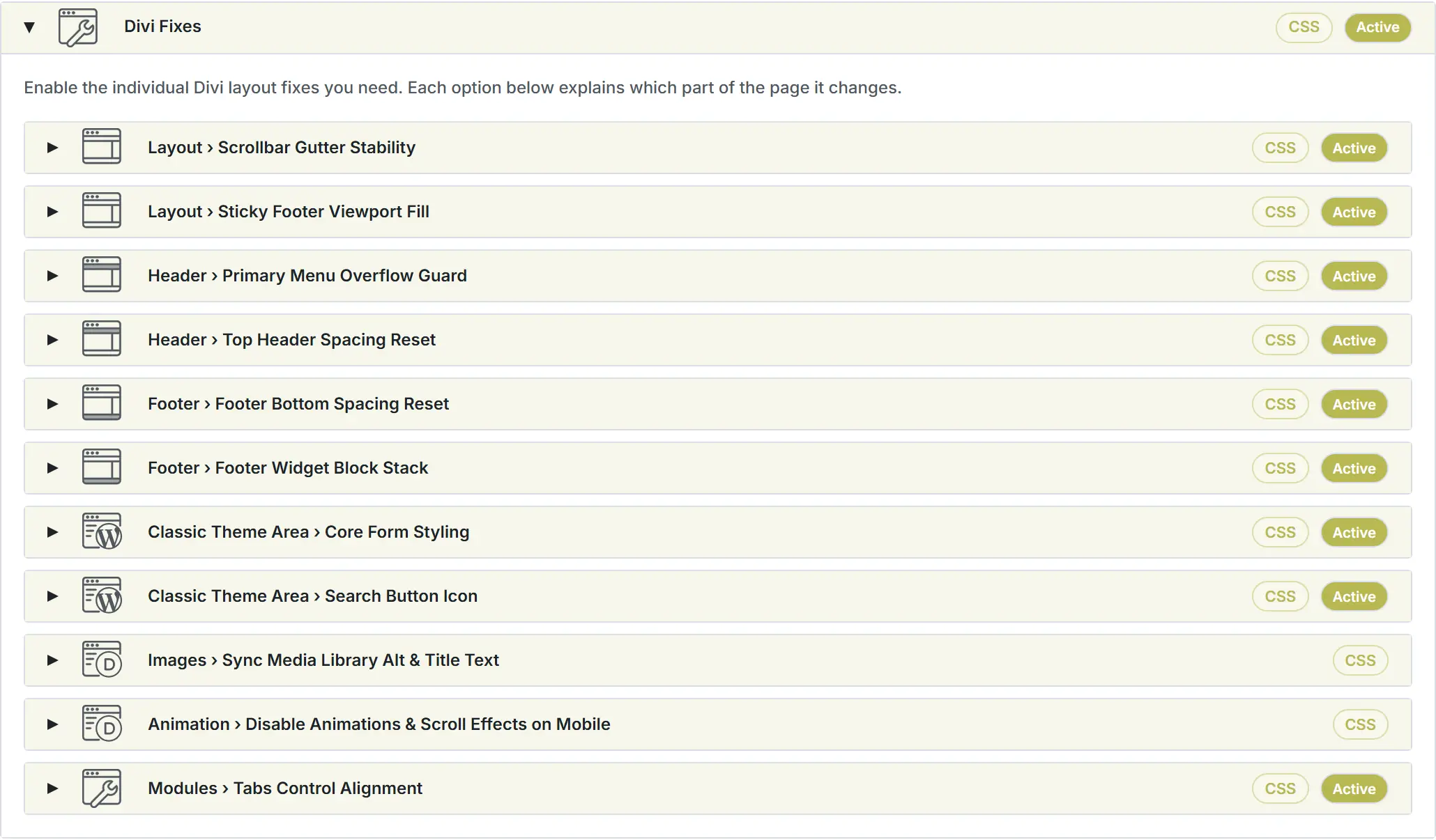
Divi Fixes

Enabled Divi Fixes keep selected Divi, WordPress, and theme-area surfaces aligned with the fluid foundation where native Divi output would otherwise leave layout or spacing gaps.
| Element | What It Controls |
|---|---|
| Scrollbar Gutter Stability Fix | Prevents horizontal layout shifts when navigating between short pages without a scrollbar and long pages with a scrollbar. Outputs scrollbar-gutter: stable on html so centered Divi containers keep a stable viewport gutter instead of jumping sideways when the browser scrollbar appears or disappears. |
| Sticky Footer Viewport Fill Fix | Prevents empty browser-viewport space below the footer on short pages. Uses a small flex layout on Divi page containers so #main-content expands when the page is shorter than the viewport. This is not a fixed footer; long pages still scroll normally. |
| Classic Theme Area Core Form Styling Fix | Applies consistent frontend form layout fixes to native WordPress/Core forms in classic theme areas. Targets content, sidebar, footer-widget, search, password, login, and classic comment forms while excluding WooCommerce forms, WordPress admin, standalone wp-login.php, native Divi modules, and Builder editing. Neutral form colors use Fluid Base defaults based on Divi colors; the accent still follows the Divi primary color by default. |
| Classic Theme Area Search Button Icon Fix | Replaces native Classic Theme Area Search submit text with a Search icon. When active, Search submit controls in content, sidebar, footer-widget, and Divi Sidebar module widget areas use the Fluid Base Search icon instead of visible Search text. When inactive, Fluid Base does not replace the Search text with an icon. |
| Paragraph Orphans & Balanced Headings Fix | Reduces awkward paragraph last-line single-word breaks and balances frontend heading wraps. Uses text-wrap: pretty for frontend paragraph-style text and text-wrap: balance for frontend headings where browsers support these properties. |
| Fix Top Header Spacing | Normalizes classic top-header contact, menu, and social spacing while keeping the top-header band on the shared minimum-height model. Targets #top-header #et-info, direct contact items, and #top-header ul.et-social-icons without changing footer-bottom behavior. The reset controls the inner row normalization and stable minimum height; “Classic Theme Area Overrides › Top Header” can still add optional outer shell padding on #top-header. |
| Fix Top Header Cart Icon | Keeps the WooCommerce cart icon visible in the classic Top Header on mobile widths. Found under Divi Fixes › WooCommerce Area › Top Header Cart Icon. When active and WooCommerce is available, the mobile Top Header keeps the desktop-style left contact block and right cart area. Phone and email stay left-aligned, the cart icon stays on the right, and top-header social icons are hidden. |
| Top Header Spacing Reset › Block gap | Controls the block gap between larger classic top-header blocks such as phone, email, menus, and the social icon cluster. Choose a Fluid Base spacing step from the --fb-space-* menu. The active fix uses the closest compatible spacing step for the layout it corrects. |
| Top Header Spacing Reset › Match Footer Bottom Height on Desktop | Lets the classic top header use the same minimum desktop bar height as the Footer Bottom band. Adds the shared minimum height to the top-header band while leaving the inner top-header content layout independent. When active, top-header social icons use the same intentional shared bar model as Footer Bottom, including icon size and icon spacing. |
| Top Header Spacing Reset › Always align social icons right | Moves classic top-header social icons to the right edge of the top-header row. On desktop, the duplicate social icon block inside #et-secondary-menu becomes the visible right-aligned icon block. If a Secondary Menu exists, it remains before the icons. |
| Top Header Spacing Reset › Icon spacing | Controls the gap between classic top-header social icons unless Footer Bottom height matching is enabled on desktop. Choose a Fluid Base spacing step from the --fb-space-* menu. The active fix uses the closest compatible icon spacing for the layout it corrects. |
| Fix Footer Widget Block Stack | Introduces a controlled vertical stack model for footer widgets and nested widget content. Particularly useful when classic widgets, block widgets, and inner wrapper elements need a predictable vertical rhythm. Its per-side widget and inner-wrapper spacing controls use the same shipped --fb-space-* menu model as the other fix panels. |
| Fix Footer Bottom Spacing | Zeros residual spacing on the classic footer bottom info and social rows and keeps the footer-bottom band at the shared minimum height. Targets #footer-bottom, #footer-info, and ul.et-social-icons. When enabled, it owns the #footer-bottom vertical padding, so “Classic Theme Area Overrides › Footer › Footer bottom bar padding” is disabled and kept for reference. |
| Footer Bottom Spacing Reset › Block gap | Controls the footer bottom block gap between the text block and the social icon block. Choose a Fluid Base spacing step from the --fb-space-* menu. The active fix uses the closest compatible spacing step for the layout it corrects. |
| Footer Bottom Spacing Reset › Icon spacing | Controls the gap between classic footer bottom social icons. Choose a Fluid Base spacing step from the --fb-space-* menu. The active fix uses the closest compatible icon spacing for the layout it corrects. |
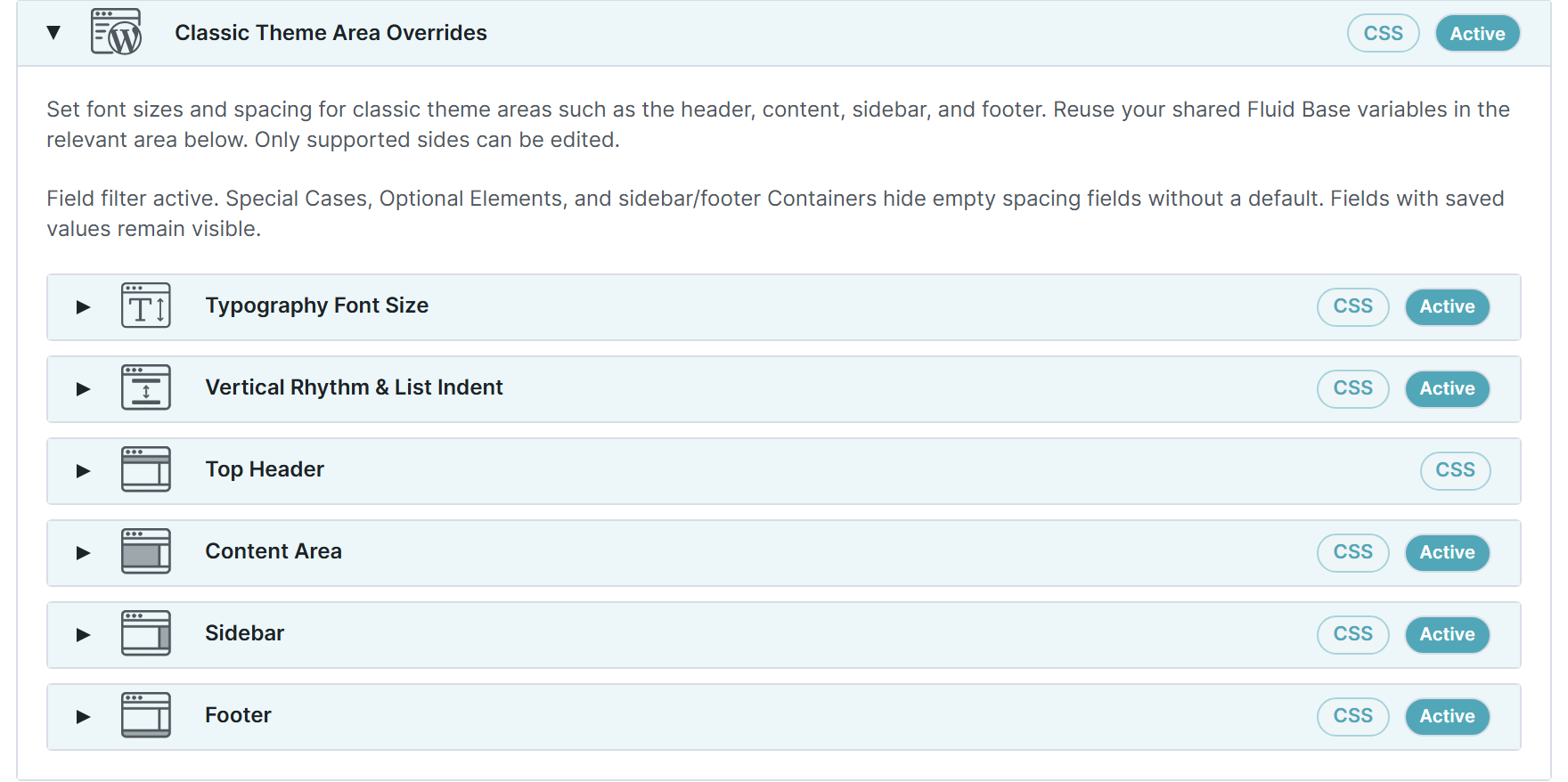
Classic Theme Area Overrides
Classic WordPress and Divi theme areas often remain visible on real websites, especially older client sites or hybrid builds. These settings help menus, sidebars, widgets, content shells, comments, forms, archives, and footer areas stay visually aligned with the same Fluid Base foundation.

Typography
| Element | What It Controls |
|---|---|
Page Title <h1> |
Controls the Fluid Base font size and rhythm for Page Title <h1> in the matching WordPress, Classic, or WooCommerce area.
Technical Reference:
|
Blog Post Listing Title <h2> |
Controls the Fluid Base font size and rhythm for Blog Post Listing Title <h2> in the matching WordPress, Classic, or WooCommerce area.
Technical Reference:
|
Widget Block Group Heading <h2> |
Controls the Fluid Base font size and rhythm for Widget Block Group Heading <h2> in the matching WordPress, Classic, or WooCommerce area.
Technical Reference:
|
Widget Block Group Heading <h3> |
Controls the Fluid Base font size and rhythm for Widget Block Group Heading <h3> in the matching WordPress, Classic, or WooCommerce area.
Technical Reference:
|
Widget Title Classic <h4> |
Controls the Fluid Base font size and rhythm for Widget Title Classic <h4> in the matching WordPress, Classic, or WooCommerce area.
Technical Reference:
|
Widget Heading <h1> |
Controls the Fluid Base font size and rhythm for Widget Heading <h1> in the matching WordPress, Classic, or WooCommerce area.
Technical Reference:
|
Widget Heading <h2> |
Controls the Fluid Base font size and rhythm for Widget Heading <h2> in the matching WordPress, Classic, or WooCommerce area.
Technical Reference:
|
Widget Heading <h3> |
Controls the Fluid Base font size and rhythm for Widget Heading <h3> in the matching WordPress, Classic, or WooCommerce area.
Technical Reference:
|
Widget Heading <h4> |
Controls the Fluid Base font size and rhythm for Widget Heading <h4> in the matching WordPress, Classic, or WooCommerce area.
Technical Reference:
|
Widget Heading <h5> |
Controls the Fluid Base font size and rhythm for Widget Heading <h5> in the matching WordPress, Classic, or WooCommerce area.
Technical Reference:
|
Widget Heading <h6> |
Controls the Fluid Base font size and rhythm for Widget Heading <h6> in the matching WordPress, Classic, or WooCommerce area.
Technical Reference:
|
Widget Block Heading <h1> |
Controls the Fluid Base font size and rhythm for Widget Block Heading <h1> in the matching WordPress, Classic, or WooCommerce area.
Technical Reference:
|
Widget Block Heading <h2> |
Controls the Fluid Base font size and rhythm for Widget Block Heading <h2> in the matching WordPress, Classic, or WooCommerce area.
Technical Reference:
|
Widget Block Heading <h3> |
Controls the Fluid Base font size and rhythm for Widget Block Heading <h3> in the matching WordPress, Classic, or WooCommerce area.
Technical Reference:
|
Widget Block Heading <h4> |
Controls the Fluid Base font size and rhythm for Widget Block Heading <h4> in the matching WordPress, Classic, or WooCommerce area.
Technical Reference:
|
Widget Block Heading <h5> |
Controls the Fluid Base font size and rhythm for Widget Block Heading <h5> in the matching WordPress, Classic, or WooCommerce area.
Technical Reference:
|
Widget Block Heading <h6> |
Controls the Fluid Base font size and rhythm for Widget Block Heading <h6> in the matching WordPress, Classic, or WooCommerce area.
Technical Reference:
|
Widget Title Classic <h4> |
Controls the Fluid Base font size and rhythm for Widget Title Classic <h4> in the matching WordPress, Classic, or WooCommerce area.
Technical Reference:
|
| Footer Widget Body Text | Body, list, and link text inside classic footer widgets.
Technical Reference:
|
| Footer Widget Controls | Native footer widget inputs, selects, textareas, search fields, and search buttons.
Technical Reference:
|
Widget Heading <h1> |
Controls the Fluid Base font size and rhythm for Widget Heading <h1> in the matching WordPress, Classic, or WooCommerce area.
Technical Reference:
|
Widget Heading <h2> |
Controls the Fluid Base font size and rhythm for Widget Heading <h2> in the matching WordPress, Classic, or WooCommerce area.
Technical Reference:
|
Widget Heading <h3> |
Controls the Fluid Base font size and rhythm for Widget Heading <h3> in the matching WordPress, Classic, or WooCommerce area.
Technical Reference:
|
Widget Heading <h4> |
Controls the Fluid Base font size and rhythm for Widget Heading <h4> in the matching WordPress, Classic, or WooCommerce area.
Technical Reference:
|
Widget Heading <h5> |
Controls the Fluid Base font size and rhythm for Widget Heading <h5> in the matching WordPress, Classic, or WooCommerce area.
Technical Reference:
|
Widget Heading <h6> |
Controls the Fluid Base font size and rhythm for Widget Heading <h6> in the matching WordPress, Classic, or WooCommerce area.
Technical Reference:
|
Content Heading <h1> |
Generic headings inside WordPress content areas.
Technical Reference:
|
Content Heading <h2> |
Generic headings inside WordPress content areas.
Technical Reference:
|
Content Heading <h3> |
Generic headings inside WordPress content areas.
Technical Reference:
|
Content Heading <h4> |
Generic headings inside WordPress content areas.
Technical Reference:
|
Content Heading <h5> |
Generic headings inside WordPress content areas.
Technical Reference:
|
Content Heading <h6> |
Generic headings inside WordPress content areas.
Technical Reference:
|
| Comment Body Text | Body text in classic WordPress comment lists.
Technical Reference:
|
| Comment Meta Text | Comment author, date, reply, and supporting metadata.
Technical Reference:
|
Comment Reply Title <h3> |
Heading above the classic WordPress comment form.
Technical Reference:
|
| Caption Text | WordPress image, figure, and media caption text in standard content areas.
Technical Reference:
|
| WordPress Form Labels | Labels in native WordPress comment, content, and search-related forms.
Technical Reference:
|
| WordPress Form Fields | Native WordPress text inputs, selects, textareas, and search fields outside WooCommerce.
Technical Reference:
|
| WordPress Area Buttons | Native WordPress comment, login, password, and search form submit buttons in WordPress content areas. Divi Builder buttons keep native Divi alignment.
Technical Reference:
|
| Sidebar Widget Body Text | Body, list, and link text inside native WordPress sidebar widgets and Divi Sidebar module widget areas.
Technical Reference:
|
| Sidebar Widget Controls | Native WordPress sidebar widget inputs, select controls, and search buttons, including Divi Sidebar module widget areas.
Technical Reference:
|
| Pagination And Utility Links | Older/newer links, post navigation, page links, and pagination UI in classic WordPress areas.
Technical Reference:
|
Widget Heading <h1> |
Controls the Fluid Base font size and rhythm for Widget Heading <h1> in the matching WordPress, Classic, or WooCommerce area.
Technical Reference:
|
Widget Heading <h2> |
Controls the Fluid Base font size and rhythm for Widget Heading <h2> in the matching WordPress, Classic, or WooCommerce area.
Technical Reference:
|
Widget Heading <h3> |
Controls the Fluid Base font size and rhythm for Widget Heading <h3> in the matching WordPress, Classic, or WooCommerce area.
Technical Reference:
|
Widget Heading <h4> |
Controls the Fluid Base font size and rhythm for Widget Heading <h4> in the matching WordPress, Classic, or WooCommerce area.
Technical Reference:
|
Widget Heading <h5> |
Controls the Fluid Base font size and rhythm for Widget Heading <h5> in the matching WordPress, Classic, or WooCommerce area.
Technical Reference:
|
Widget Heading <h6> |
Controls the Fluid Base font size and rhythm for Widget Heading <h6> in the matching WordPress, Classic, or WooCommerce area.
Technical Reference:
|
Widget Block Heading <h1> |
Controls the Fluid Base font size and rhythm for Widget Block Heading <h1> in the matching WordPress, Classic, or WooCommerce area.
Technical Reference:
|
Widget Block Heading <h2> |
Controls the Fluid Base font size and rhythm for Widget Block Heading <h2> in the matching WordPress, Classic, or WooCommerce area.
Technical Reference:
|
Widget Block Heading <h3> |
Controls the Fluid Base font size and rhythm for Widget Block Heading <h3> in the matching WordPress, Classic, or WooCommerce area.
Technical Reference:
|
Widget Block Heading <h4> |
Controls the Fluid Base font size and rhythm for Widget Block Heading <h4> in the matching WordPress, Classic, or WooCommerce area.
Technical Reference:
|
Widget Block Heading <h5> |
Controls the Fluid Base font size and rhythm for Widget Block Heading <h5> in the matching WordPress, Classic, or WooCommerce area.
Technical Reference:
|
Widget Block Heading <h6> |
Controls the Fluid Base font size and rhythm for Widget Block Heading <h6> in the matching WordPress, Classic, or WooCommerce area.
Technical Reference:
|
Vertical Rhythm & List Indent
Use this panel to make Classic content, Sidebar, and Footer text spacing follow the same vertical rhythm as Builder text.
| Element | What It Controls |
|---|---|
| Paragraph after spacing | Sets the vertical rhythm after paragraphs so text blocks scale consistently with the fluid spacing system. Controls the listed content rhythm value for the matching heading or text-flow role. |
| List block after spacing | Sets the spacing after a complete unordered or ordered list before the next content block begins. Controls the listed content rhythm value for the matching heading or text-flow role. |
| List item after spacing | Controls the spacing between list items so lists stay tighter than normal paragraph flow. Controls the listed content rhythm value for the matching heading or text-flow role. |
| List indent | Defines the left padding for normal unordered and ordered lists. Frontend output keeps a safe minimum inset for visible native markers so markers cannot protrude past the content edge. Controls the paired top/bottom or left/right values for this content rhythm setting. |
| List marker gap | Controls the padding between list markers and list item text for unordered and ordered lists. Controls the paired top/bottom or left/right values for this content rhythm setting. |
| Nested list spacing | Controls the top and bottom spacing around nested lists so sub-items stay visually connected to their parent item. Controls the paired top/bottom or left/right values for this content rhythm setting. |
| Nested list item after spacing | Controls the spacing between nested list items separately from the root list rhythm. Controls the listed content rhythm value for the matching heading or text-flow role. |
| Nested list indent | Sets the inset for nested lists so second-level list content aligns cleanly within the fluid typography rhythm. Controls the paired top/bottom or left/right values for this content rhythm setting. |
| Definition list after spacing | Sets the spacing after a definition list before normal content flow continues. Controls the listed content rhythm value for the matching heading or text-flow role. |
| Definition description indent | Sets the inset for definition descriptions so each description stays grouped with its term. Controls the listed content rhythm value for the matching heading or text-flow role. |
| Definition description after spacing | Sets the spacing after each definition description so term and description pairs stay readable. Controls the listed content rhythm value for the matching heading or text-flow role. |
| Preformatted block after spacing | Sets the spacing after preformatted and code blocks within shared content flow. Controls the listed content rhythm value for the matching heading or text-flow role. |
| Preformatted block padding | Controls the native inset inside preformatted blocks. Controls the paired top/bottom or left/right values for this content rhythm setting. |
| Blockquote spacing | Sets the top and bottom spacing around blockquotes so quoted content stands apart from normal paragraphs. Controls the paired top/bottom or left/right values for this content rhythm setting. |
| Blockquote inline inset | Sets the inline inset for blockquotes so the quote body is clearly separated from normal body copy. Controls the listed content rhythm value for the matching heading or text-flow role. |
| Table spacing | Sets the top and bottom spacing around tables so they read as distinct content blocks. Controls the paired top/bottom or left/right values for this content rhythm setting. |
| Table header cell spacing | Sets the inside spacing for all four sides of table header cells. Controls the paired top/bottom or left/right values for this content rhythm setting. |
| Table body cell spacing | Sets the inside spacing for all four sides of table body cells. Controls the paired top/bottom or left/right values for this content rhythm setting. |
| Heading spacing | Sets the space above a content heading and between the heading and the text that follows it. Controls the paired top/bottom or left/right values for this content rhythm setting. |
Top Header
| Element | What It Controls |
|---|---|
| Top header area › Padding | Adds optional outer vertical padding around the classic Top Header row. This can be used together with “Header › Top Header Spacing Reset” when the row needs more breathing room. Targets native WordPress layout areas and wrappers instead of individual Divi module fields. Technical Reference:
|
Content Area
Content Area
| Element | What It Controls |
|---|---|
| Content area › Content column padding | Controls top and bottom spacing for the classic content column when no Theme Builder body override is active. Targets native WordPress layout areas and wrappers instead of individual Divi module fields. Technical Reference:
|
| Content area › Shell padding | Controls outer top and bottom spacing for classic Divi templates that still use the native content shell. Targets native WordPress layout areas and wrappers instead of individual Divi module fields. Technical Reference:
|
| Content area › Single post bottom padding | Controls bottom spacing for the classic single-post article wrapper when no Theme Builder body override is active. Targets native WordPress layout areas and wrappers instead of individual Divi module fields. Technical Reference:
|
| Content area › Right-sidebar gap | Controls the desktop gap between the main content column and a right sidebar. Targets native WordPress layout areas and wrappers instead of individual Divi module fields. Technical Reference:
|
| Content area › Left-sidebar gap | Controls the desktop gap between the main content column and a left sidebar. Targets native WordPress layout areas and wrappers instead of individual Divi module fields. Technical Reference:
|
Special Cases
| Element | What It Controls |
|---|---|
| Content area › Special Cases › Post meta line | Controls spacing below the native Divi post-meta line in the left content area. Applies this spacing role to Content area › Special Cases › Post meta line in the matching classic content context. Technical Reference:
|
| Content area › Special Cases › Featured image block | Spacing below Divi’s featured-image wrapper in standard post content. Applies this spacing role to Content area › Special Cases › Featured image block in the matching classic content context. Technical Reference:
|
| Content area › Special Cases › Main title | Controls bottom spacing below the native Divi page or post title. Applies this spacing role to Content area › Special Cases › Main title in the matching classic content context. Technical Reference:
|
| Content area › Special Cases › First gallery block in gallery-format posts | Negative offset that matches Divi’s gallery-format post treatment for the first gallery block. Applies this spacing role to Content area › Special Cases › First gallery block in gallery-format posts in the matching classic content context. Technical Reference:
|
Sidebar
Sidebar Area
| Element | What It Controls |
|---|---|
| Sidebar area › Desktop padding | Controls top and bottom spacing inside the native Divi sidebar on desktop layouts. Targets native WordPress layout areas and wrappers instead of individual Divi module fields. Technical Reference:
|
| Sidebar area › Stacked padding | Controls sidebar top and bottom spacing when the sidebar stacks below the content on smaller screens. Targets native WordPress layout areas and wrappers instead of individual Divi module fields. Technical Reference:
|
| Sidebar area › Right-sidebar inner padding | Controls desktop inner padding inside the native Divi sidebar for right-sidebar layouts. Targets native WordPress layout areas and wrappers instead of individual Divi module fields. Technical Reference:
|
| Sidebar area › Left-sidebar inner padding | Controls desktop inner padding inside the native Divi sidebar for left-sidebar layouts. Targets native WordPress layout areas and wrappers instead of individual Divi module fields. Technical Reference:
|
Containers
| Element | What It Controls |
|---|---|
| Sidebar widget area › Sidebar widget wrapper | Controls spacing around native Divi sidebar widget wrappers. Targets native WordPress layout areas and wrappers instead of individual Divi module fields. Technical Reference:
|
| Sidebar widget area › Sidebar block widget wrapper | Controls spacing around block-based widgets in the native Divi sidebar. Targets native WordPress layout areas and wrappers instead of individual Divi module fields. Technical Reference:
|
| Sidebar widget area › Sidebar block group | Controls spacing around nested block groups inside block-based sidebar widgets. Targets native WordPress layout areas and wrappers instead of individual Divi module fields. Technical Reference:
|
Footer
Footer Shell
| Element | What It Controls |
|---|---|
| Footer area › Padding | Controls top and bottom padding around the classic footer area. Targets native WordPress layout areas and wrappers instead of individual Divi module fields. Technical Reference:
|
Widget Area
| Element | What It Controls |
|---|---|
| Footer widget area › Padding | Controls outer top and bottom padding around the footer widget area before the widget columns begin. Targets native WordPress layout areas and wrappers instead of individual Divi module fields. Technical Reference:
|
Navigation
| Element | What It Controls |
|---|---|
| Footer navigation › Padding | Controls vertical spacing for the classic footer navigation row below the widget area. Targets native WordPress layout areas and wrappers instead of individual Divi module fields. Technical Reference:
|
Bottom Bar
| Element | What It Controls |
|---|---|
| Footer bottom bar › Padding | Controls vertical spacing for the classic footer bottom bar that contains credits and social icons. Targets native WordPress layout areas and wrappers instead of individual Divi module fields. Technical Reference:
|
Containers
| Element | What It Controls |
|---|---|
| Footer widget area › Footer widget wrapper | Controls spacing around the main footer widget wrapper used by classic and block widgets. Targets native WordPress layout areas and wrappers instead of individual Divi module fields. Technical Reference:
|
| Footer widget area › Footer widget inner wrapper | Controls spacing around the inner wrapper used by Divi footer widgets. Targets native WordPress layout areas and wrappers instead of individual Divi module fields. Technical Reference:
|
| Footer widget area › Footer block group | Controls spacing around nested block groups inside footer block widgets. Targets native WordPress layout areas and wrappers instead of individual Divi module fields. Technical Reference:
|
WooCommerce Area Overrides
WooCommerce pages can easily feel disconnected from the rest of a Divi site because product titles, prices, notices, tabs, forms, and shop loops have their own output patterns. These settings let supported WooCommerce areas follow the same typography and spacing logic as the rest of the website.

Typography
| Element | What It Controls |
|---|---|
Product Title <h1> |
Controls the Fluid Base font size and rhythm for Product Title <h1> in the matching WordPress, Classic, or WooCommerce area.
Technical Reference:
|
Related Products <h2> |
Controls the Fluid Base font size and rhythm for Related Products <h2> in the matching WordPress, Classic, or WooCommerce area.
Technical Reference:
|
| Product Loop Title | Product titles in Divi-native WooCommerce shop and product taxonomy loops.
Technical Reference:
|
| Product Loop Sale Badge | Sale badge text in Divi-native WooCommerce shop, product taxonomy, and single-product related/upsell loops.
Technical Reference:
|
| Product Loop Price | Price text, regular-price strike-through, and sale-price text in Divi-native WooCommerce shop, product taxonomy, and single-product related/upsell loops.
Technical Reference:
|
| Product Loop Helper Text | Compact product-loop helper text in Divi-native WooCommerce shop, product taxonomy, and single-product related/upsell loops. WooCommerce rating icons and sale badges keep their native layout metrics.
Technical Reference:
|
| WooCommerce Utility Text | Result counts, pagination, empty-cart notices, and compact utility copy on Divi-native WooCommerce archive and cart pages.
Technical Reference:
|
Archive Title <h1> |
Main heading on Divi-native WooCommerce shop and product taxonomy archive pages.
Technical Reference:
|
| Archive Sort Controls | Product ordering labels and select controls on Divi-native WooCommerce shop and product taxonomy archive pages.
Technical Reference:
|
| Single Product Price | Prominent price text in the Divi-native single product summary.
Technical Reference:
|
| Single Product Summary Text | Product summary and short-description text in the Divi-native single product detail area.
Technical Reference:
|
| Product Detail Meta | Stock, SKU, category, tag, and compact product-detail metadata in Divi-native single product templates.
Technical Reference:
|
| Product Tabs Navigation | Navigation labels in WooCommerce single-product tabs.
Technical Reference:
|
| Product Tabs Body Text | Content text inside WooCommerce single-product tab panels.
Technical Reference:
|
| Product Tabs Headings | Headings inside WooCommerce single-product tab panels.
Technical Reference:
|
| Product Reviews Heading | Main reviews heading on WooCommerce single product pages.
Technical Reference:
|
| Product Review Body Text | Review body text on WooCommerce single product pages.
Technical Reference:
|
| Product Review Meta Text | Review author, date, and supporting review metadata on WooCommerce single product pages. WooCommerce rating icons keep their native layout metrics.
Technical Reference:
|
| Product Form Labels | Labels in Divi-native single product quantity and review forms.
Technical Reference:
|
| Product Form Fields | Quantity, rating, and review fields in Divi-native single product forms.
Technical Reference:
|
Fluid Base Previews

The Setup tab ends with Typography, Spacing, and Variables preview/reference panels. These panels show how the current Fluid Base foundation is calculated after the main setup and override panels are configured.
User Manual
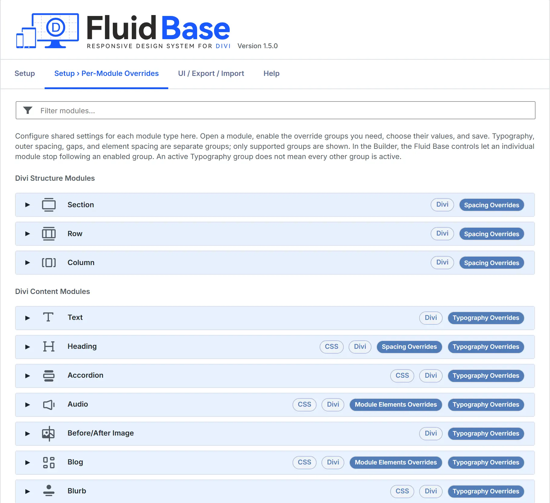
Per-Module Overrides

Per-Module Overrides are for repeated design patterns. Instead of adjusting every Blog, Blurb, Contact Form, Pricing Table, Toggle, Slider, or Woo module instance manually, configure shared defaults for that module type and keep local exceptions available when needed.
Module spacing and Layout Gap are explained in the card section below. The target lists in the module tables only name typography roles and element-specific spacing targets.
How Module Cards Are Organized
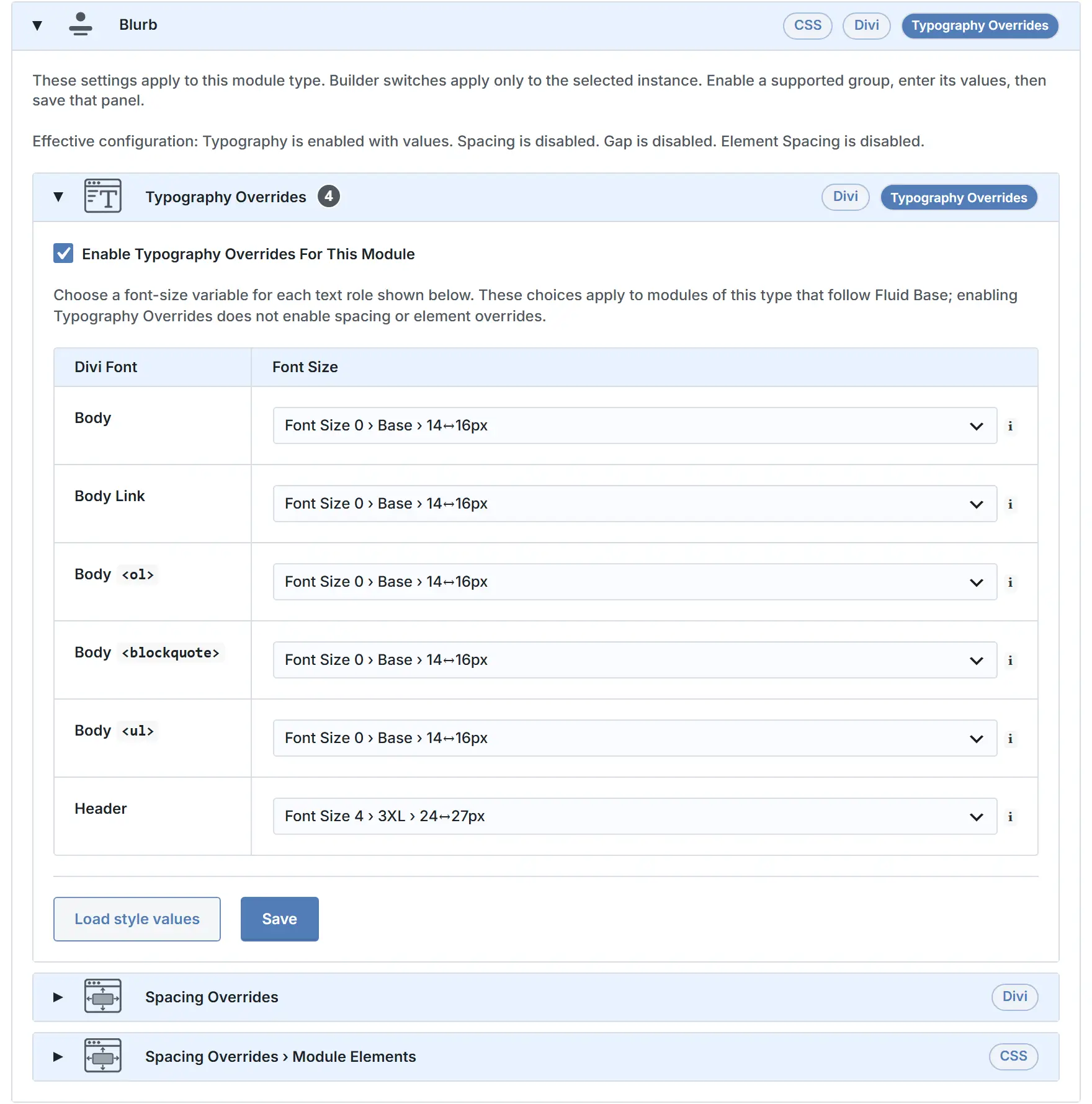
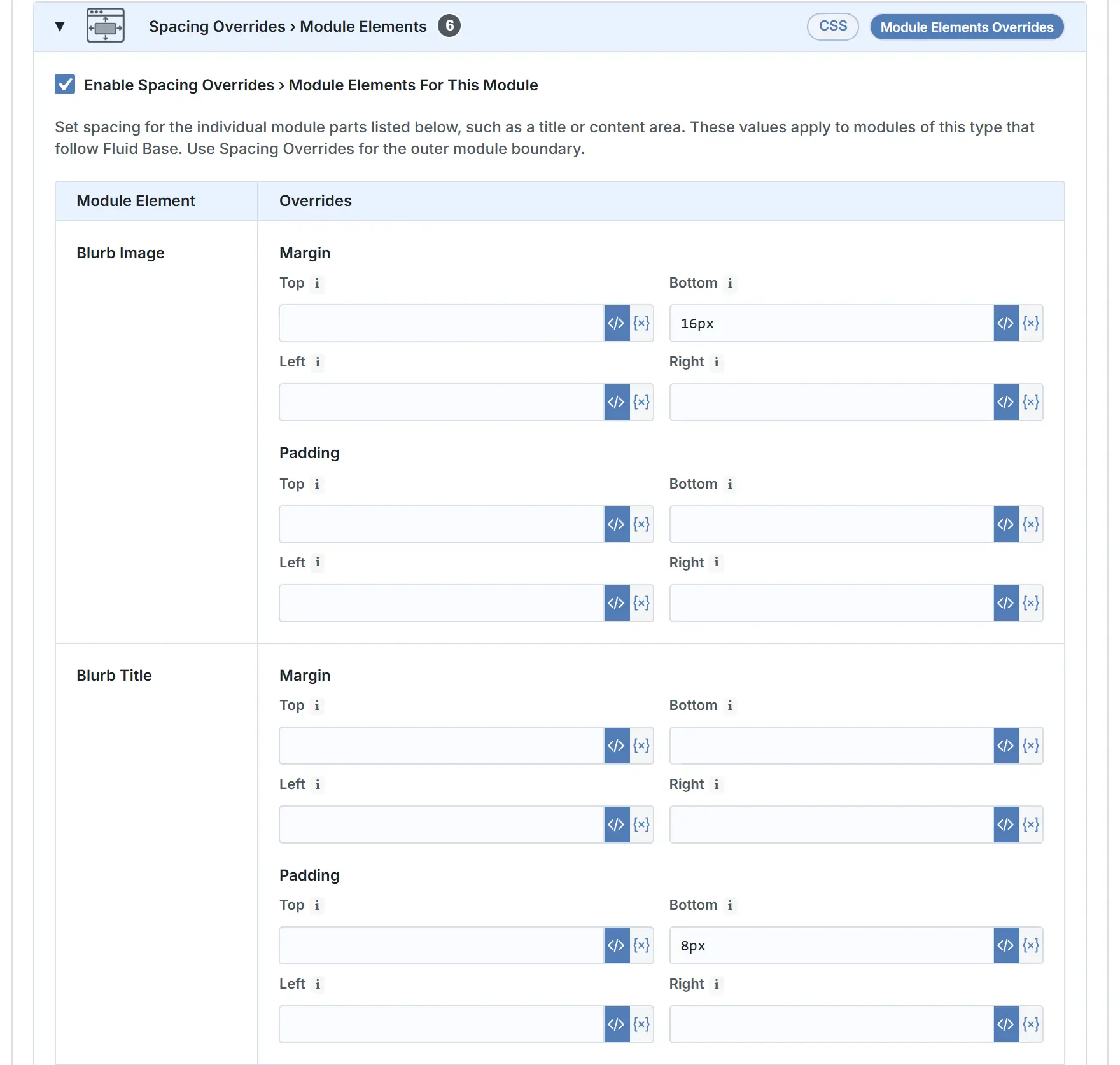
Each module card keeps the same reading order as the admin: Typography Overrides when the module supports them, Spacing Overrides for the module wrapper and supported Layout Gap fields, then Spacing Overrides › Module Elements for supported inner parts. Divi badges mark values that stay in Divi fields; CSS badges mark output Fluid Base styles directly where Divi has no matching field.
Each module card has one settings form, but the nested panels keep Reset and Save actions scoped to the panel shown. Saving element spacing does not rewrite typography, and saving typography does not rewrite module spacing. The FB-icon Visual Builder modal shows switches only for settings that are active for this module type in Per-Module Overrides.
Switching a setting off in the Builder modal creates an exception for the selected module only. The shared defaults on this page stay unchanged, so the site-wide module foundation remains predictable.
| Input | What It Controls |
|---|---|
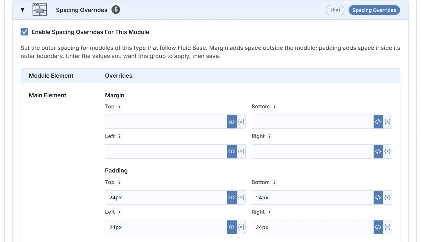
| Enable Spacing Overrides For This Module | Enables shared outer spacing for this module type. When it is active, the Margin and Padding rows can set the module wrapper spacing for every module of this type that still follows Fluid Base. |
| Enable Layout Gap Overrides For This Module | Enables shared gap values for modules with supported native gap fields. Use it where child items, columns, or stacked module parts should keep the same internal distance across the site. |
| Enable Spacing Overrides › Module Elements For This Module | Enables supported inner element controls for this module type. Use it when a specific module part, such as a title, tab content, message field, pricing area, or toggle content, should share one Padding or Margin value. |
| Margin rows | Set outer spacing around the module wrapper. Leave a side empty when Divi’s own spacing should remain in charge. |
| Padding rows | Set padding inside the module wrapper. For Section and Row, this is the live module path used for deliberate exceptions to Section/Row Auto-Apply or the legacy height model. |
| Gap › Horizontal | Set horizontal child gap where the module exposes a supported horizontal gap axis. |
| Gap › Vertical | Set vertical child gap where stacked children or compatible module layouts expose a supported vertical gap axis. |
| Element Padding rows | Set padding on supported module parts such as Toggle, Message Field, Tabs Content, or Pricing Content. |
| Element Margin rows | Set margin on supported module parts such as Toggle Title, Blurb Title, Contact Title, Promo Title, or Pricing Title. |
| Enable Typography Overrides For This Module | Enables shared font-size choices for the text roles supported by this module type. Use it when the module text should follow the same fluid scale as the rest of the site. |
| Divi Font › Text / Heading / Role rows | Assign each supported text role to a Fluid Base font-size variable. Static Text and Heading modules use tag-style rows; dynamic modules use role labels such as title, meta, excerpt, price, or other detected text roles. |
Use these rows as orientation only. The exact reset values and selected font-size variables stay visible inside the matching module card.
How to think about module typography overrides
Text modules use tag-based mappings such as Text, <h1>, <h2>, and so on. Dynamic modules can use role-based mappings such as title, meta, price, excerpt, or other module-specific text roles. In both cases the goal is the same: module text should belong to the native fluid typography system unless you deliberately choose otherwise.
Divi Structure Modules
Structure-module overrides are for the core layout rhythm: Section, Row, and Column. Use the Section and Row cards mainly for deliberate exceptions when the shared Section/Row rhythm already controls the page foundation.
| Module | Typography Targets / Element Spacing Targets |
|---|---|
| Section |
Typography Targets: – Element Spacing Targets: – |
| Row |
Typography Targets: – Element Spacing Targets: – |
| Column |
Typography Targets: – Element Spacing Targets: – |
Divi Content Modules
Content-module cards use the same pattern across module types: wrapper spacing controls the outside of the module, supported Layout Gap fields control internal gaps, element spacing controls supported inner parts, and typography choices keep module text on the shared fluid scale.
| Module | Typography Targets / Element Spacing Targets |
|---|---|
| Text |
Typography Targets: Text, Element Spacing Targets: – |
| Heading |
Typography Targets:
Element Spacing Targets: Heading Container |
| Accordion |
Typography Targets: Body, Body Link, Body Element Spacing Targets: Toggle, Open Toggle, Toggle Title, Toggle Icon, Toggle Content |
| Audio |
Typography Targets: Caption Text, Title Text Element Spacing Targets: Audio Cover Art, Audio Content, Audio Title, Audio Meta, Player Buttons, Player Timer, Player Sliders, Player Sliders Current |
| Before/After Image |
Typography Targets: Label Element Spacing Targets: – |
| Blog |
Typography Targets: Title Text, Meta Text, Read More Text, Pagination Text, Body, Body Link, Body Element Spacing Targets: Title, Body, Post Meta, Pagenavi, Featured Image, Read More Button, Post Item, Featured Image Container, Featured Image Link |
| Blurb |
Typography Targets: Body, Body Link, Body Element Spacing Targets: Blurb Image, Blurb Title, Blurb Content |
| Button |
Typography Targets: Button Element Spacing Targets: – |
| Canvas Portal |
Typography Targets: – Element Spacing Targets: – |
| Circle Counter |
Typography Targets: Number, Title Element Spacing Targets: Percent Container, Circle Counter Title, Percent Text |
| Code |
Typography Targets: – Element Spacing Targets: – |
| Comments |
Typography Targets: Comment Count Text, Form Title Text, Meta Text, Comment Text, Form Field, Button Element Spacing Targets: Comments Count, Comment Body, Comment Meta, Comment Content, Comment Avatar, Reply Button, New Comment Title, Message Field, Name Field, Email Field, Website Field, Submit Button |
| Contact Form |
Typography Targets: Title Text, Captcha Text, Form Field, Button Element Spacing Targets: Contact Title, Form Fields, Message Field, Captcha Field, Captcha Text |
| Countdown Timer |
Typography Targets: Header, Label, Numbers, Separator Element Spacing Targets: Container, Title, Timer Section |
| Bar Counters |
Typography Targets: Percentage Text, Title Text Element Spacing Targets: Counter Title, Counter Container, Counter Amount |
| Call To Action |
Typography Targets: Body, Body Link, Body Element Spacing Targets: Promo Description, Promo Button, Promo Title |
| Divider |
Typography Targets: – Element Spacing Targets: – |
| Dropdown |
Typography Targets: – Element Spacing Targets: – |
| Filterable Portfolio |
Typography Targets: Meta Text, Filter Criteria Text, Pagination Text, Title Text Element Spacing Targets: Portfolio Filters, Active Portfolio Filter, Portfolio Image, Overlay, Overlay Icon, Portfolio Title, Portfolio Post Meta, Portfolio Pagination, Portfolio Pagination Active |
| Hero |
Typography Targets: Content, Contentlink, Contentol, Contentquote, Contentul, Subhead, Title, Button One, Button Two Element Spacing Targets: Header Container, Header Image, Logo, Title, Body, Subtitle, Button One, Button Two, Scroll Down Button |
| Fullwidth Menu |
Typography Targets: Default, Menu, Cart Quantity Element Spacing Targets: Menu Link, Active Menu Link, Dropdown Menu Container, Dropdown Menu Links, Menu Logo |
| Post Carousel |
Typography Targets: Meta Text, Title, Portfolio Header Element Spacing Targets: Carousel Title, Carousel Item, Item Overlay, Item Title, Meta, Navigation Arrows |
| Gallery |
Typography Targets: Title Text, Caption Text, Pagination Text Element Spacing Targets: Gallery Item, Overlay, Overlay Icon, Gallery Item Title, Gallery Item Caption, Gallery Pagination, Pagination Active Page |
| Group |
Typography Targets: – Element Spacing Targets: – |
| Group Carousel |
Typography Targets: – Element Spacing Targets: Carousel Container, Carousel Track, Carousel Slide, Carousel Active Slide, Carousel Arrows, Carousel Dots |
| Icon |
Typography Targets: – Element Spacing Targets: Icon Element |
| Icon List |
Typography Targets: Body Element Spacing Targets: Icon, Text |
| Image |
Typography Targets: – Element Spacing Targets: Image |
| Instagram Feed |
Typography Targets: Follow Button Element Spacing Targets: – |
| Link |
Typography Targets: Body Element Spacing Targets: Icon |
| Login |
Typography Targets: Body, Body Link, Body Element Spacing Targets: Login Title, Login Description, Login Form, Login Fields, Login Button |
| Lottie |
Typography Targets: – Element Spacing Targets: Lottie Animation |
| Map |
Typography Targets: – Element Spacing Targets: – |
| Menu |
Typography Targets: Default, Menu, Cart Quantity Element Spacing Targets: Menu Link, Active Menu Link, Dropdown Menu Container, Dropdown Menu Links, Menu Logo |
| Number Counter |
Typography Targets: Number Text, Title Text Element Spacing Targets: Percent, Number Counter Title |
| Portfolio |
Typography Targets: Meta Text, Pagination Text, Title Text Element Spacing Targets: Portfolio Image, Overlay, Overlay Icon, Portfolio Title, Portfolio Post Meta, Pagination |
| Pagination |
Typography Targets: Links Text Element Spacing Targets: Links, Previous Link, Previous Link Arrow, Next Link, Next Link Arrow |
| Post Slider |
Typography Targets: Header, Body, Meta Text, Body Link, Body Element Spacing Targets: Slide Description, Slide Title, Slide Meta, Slide Button, Slide Controllers, Slide Active Controller, Slide Image, Slide Arrows |
| Post Title |
Typography Targets: Title Text, Meta Text Element Spacing Targets: Title, Meta, Featured Image |
| Pricing Tables |
Typography Targets: Body, Body Link, Body Element Spacing Targets: Pricing Heading, Pricing Title, Pricing Subtitle, Pricing Top, Price, Currency, Frequency, Pricing Content, Pricing Item, Excluded Item, Pricing Button, Featured Table, Pricing Table, Button Wrapper |
| Search |
Typography Targets: Button, Form Field Element Spacing Targets: Input Field, Button |
| Sidebar |
Typography Targets: Body Text, Title Text Element Spacing Targets: Widget, Title |
| Email Optin |
Typography Targets: Header, Body, Result Message Text, Form Field, Body Link, Body Element Spacing Targets: Opt-in Title, Opt-in Description, Opt-in Form, Opt-in Form Fields, Subscribe Button, Field Wrapper |
| Slider |
Typography Targets: Body, Body Link, Body Element Spacing Targets: Slide Description, Slide Title, Slide Button, Slide Controllers, Slide Active Controller, Slide Image, Slide Arrows |
| Social Media Follow |
Typography Targets: Follow Button Element Spacing Targets: Social Follow, Social Icon, Follow Button |
| Table of Contents |
Typography Targets: Title Text, List Text, List Level 1 Text, List Level 2 Text, List Level 3 Text, List Level 4 Text, List Level 5 Text, List Level 6 Text, Marker Text, Empty State Text Element Spacing Targets: Title, List, Link, Marker, Empty State |
| Tabs |
Typography Targets: Body, Body Link, Body Element Spacing Targets: Tabs Controls, Tab, Active Tab, Tabs Content |
| Person |
Typography Targets: Body, Body Link, Body Element Spacing Targets: Member Image, Member Description, Title, Member Position, Member Social Links |
| Testimonial |
Typography Targets: Author, Body, Body Link, Body Element Spacing Targets: Testimonial Portrait, Testimonial Description, Testimonial Author, Testimonial Meta |
| Toggle |
Typography Targets: Body, Body Link, Body Element Spacing Targets: Open Toggle, Toggle Title, Toggle Icon, Toggle Content |
| Video |
Typography Targets: – Element Spacing Targets: Video Icon |
| Video Slider |
Typography Targets: Body, Body Link, Body Element Spacing Targets: Play Button, Thumbnail Item, Slider Arrows |
Divi Contact Form 7 Module
| Module | Typography Targets / Element Spacing Targets |
|---|---|
| Contact Form 7 Styler |
Typography Targets: Form Fields, Button Element Spacing Targets: Input Fields, Radio Buttons, Checkboxes, Submit Button, Validation Message, Success Message, Invalid Message, Acceptance Message, Spam Message, Failure Message, Field Wrapper |
Divi Woo Modules
| Module | Typography Targets / Element Spacing Targets |
|---|---|
| Woo Breadcrumbs |
Typography Targets: Body, Link Element Spacing Targets: – |
| Woo Notice |
Typography Targets: Content, Error, Field Label, Form Field, Link, Title, Title Link Element Spacing Targets: Title, Title Link, Body, Link, Field Label, Button, Fields, Login Form, Coupon Form |
| Woo Cart Products |
Typography Targets: Body, Form Field, Icon, Link, Table Header Element Spacing Targets: Body, Button, Column Label, Disabled Button, Input Fields, Link, Product Image, Product Name, Remove Icon, Table, Table Header Row, Table Rows, Variation Label, Table Cell |
| Woo Cart Totals |
Typography Targets: Body, Column Label, Form Field, Link, Title Element Spacing Targets: Title Text, Column Label, Body, Link, Checkout Button, Cart Totals Table, Cart Totals Table Row, Cart Totals Table Cell, Fields |
| Woo Checkout Billing |
Typography Targets: Field Label, Form Field, Formnotice, Title Element Spacing Targets: Title Text, Field Label, Fields, Form Notice |
| Woo Checkout Information |
Typography Targets: Field Label, Form Field, Title Element Spacing Targets: Title Text, Field Label, Fields |
| Woo Checkout Details |
Typography Targets: Body, Column Label, Link, Title Element Spacing Targets: Title Text, Table, Table Cell |
| Woo Checkout Payment |
Typography Targets: Body, Formnotice, Link, Radiobutton, Selectedradiobutton, Tooltip Element Spacing Targets: Body, Body Link, Button, Tooltip, Form Notice, Fields |
| Woo Checkout Shipping |
Typography Targets: Field Label, Form Field, Title Element Spacing Targets: Title Text, Field Label, Fields |
| Woo Cross Sells |
Typography Targets: Price, Title Element Spacing Targets: – |
| Woo Product Add To Cart |
Typography Targets: Dropdownmenus, Field Label, Fields Element Spacing Targets: Fields, Dropdown Menus, Buttons |
| Woo Product Information |
Typography Targets: Attribute, Body, Header, Link Element Spacing Targets: Title Text, Content Area, Attribute Row, Attribute Title, Attribute Body |
| Woo Product Description |
Typography Targets: Body, Header, Header2, Header3, Header4, Header5, Header6, Link, Ordered List, Blockquote, Unordered List Element Spacing Targets: – |
| Woo Product Gallery |
Typography Targets: Caption, Pagination, Title Element Spacing Targets: Gallery Item, Gallery Pagination, Pagination Active Page |
| Woo Product Images |
Typography Targets: Sale Badge Element Spacing Targets: Sale Badge |
| Woo Product Meta |
Typography Targets: Body, Link Element Spacing Targets: Meta Text |
| Woo Product Price |
Typography Targets: Before Sale Price, Body, Sale Price Element Spacing Targets: Price, Sale Old Price, Sale New Price |
| Woo Product Rating |
Typography Targets: Body, Rating Element Spacing Targets: Text, Star Rating |
| Woo Product Reviews |
Typography Targets: Body, Form Field, Header, Meta, Rating, Title Element Spacing Targets: Review Body, Review Meta, Review Rating, Review Avatar, New Review Title, Message Field, Name Field, Email Field, Reviews Count, Submit Button, Form Fields |
| Woo Product Stock |
Typography Targets: In Stock, On Backorder, Out of Stock Element Spacing Targets: In Stock Text, Out of Stock Text, On Backorder Text |
| Woo Product Tabs |
Typography Targets: Body, Body Link, Body Element Spacing Targets: Tabs Controls, Tab, Active Tab, Tabs Content |
| Woo Product Title |
Typography Targets: Header Element Spacing Targets: Title Text |
| Woo Product Upsell |
Typography Targets: Price, Product Title, Rating, Sale Badge, Sale Price, Title Element Spacing Targets: Product, Onsale, Image, Overlay, Title, Star Rating, Price, Old Price |
| Woo Products |
Typography Targets: Price, Rating, Sale Badge, Sale Price, Title Element Spacing Targets: Image, Onsale, Overlay, Price, Old Price, Product, Rating Container, Title |
| Woo Related Products |
Typography Targets: Price, Product Title, Rating, Sale Badge, Sale Price, Title Element Spacing Targets: Product, Onsale, Image, Overlay, Title, Star Rating, Price, Old Price |
User Manual
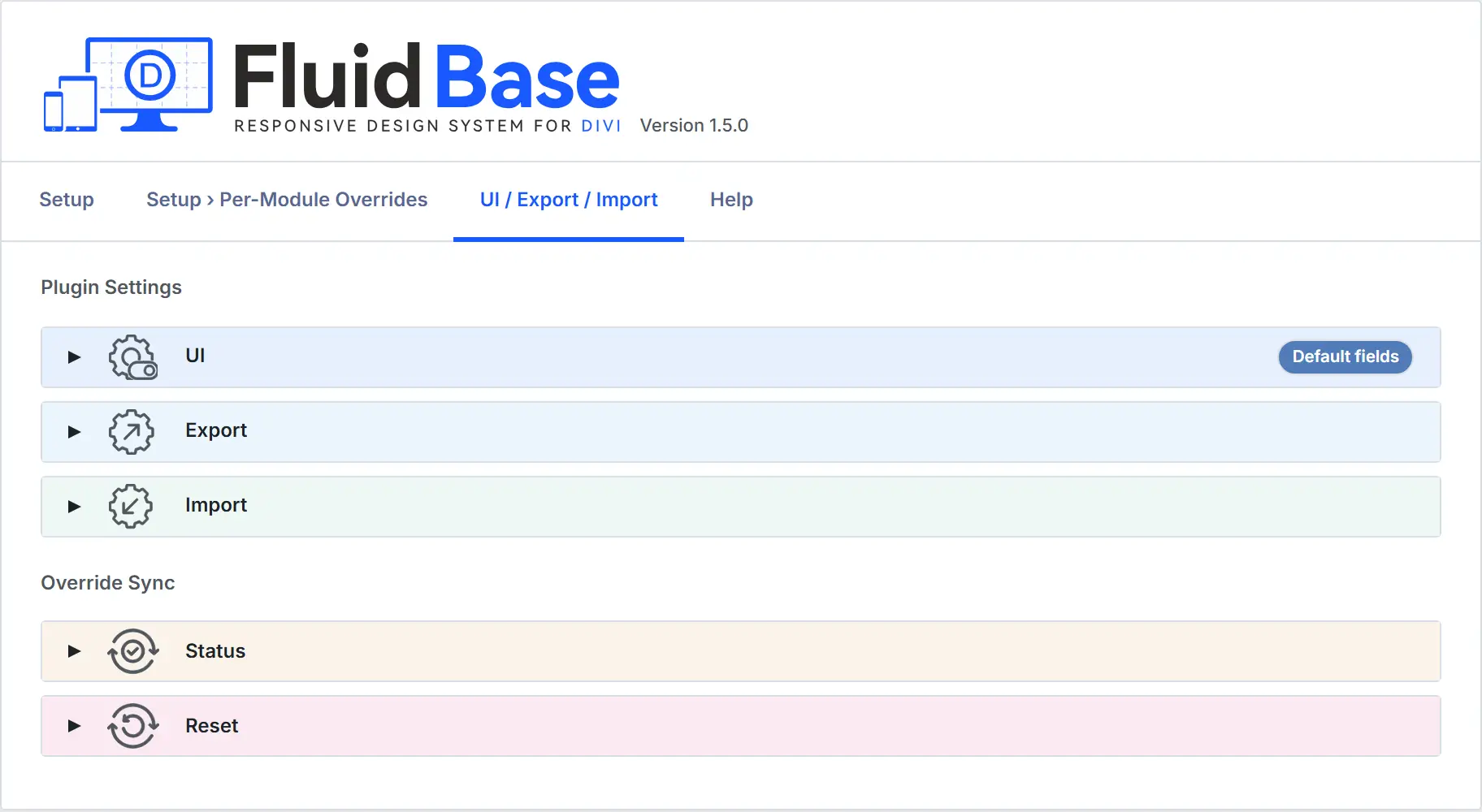
UI / Export / Import

This tab is for workflow, backup, and maintenance. It does not define the visual foundation itself, but it helps manage how much technical detail the admin shows, how settings are exported and imported, and how saved-content maintenance is handled across a project.
| Element | What It Controls |
|---|---|
| UI display | Changes only how much optional detail the Fluid Base admin shows while you work. Use it for preset-field filtering, technical CSS selectors, CSS input examples, Divi default hints, and Close all Panels. These options do not change saved design values, Builder fields, generated CSS, or frontend output. |
| Export | Downloads the current Fluid Base configuration as a JSON backup. The backup contains the export schema version, export time, setup settings, UI display preferences, and module overrides. It does not include pages, products, media, content history, full WordPress options, or environment-specific state. |
| Import | Replaces the current Fluid Base setup and module override configuration from a current-format JSON backup. After import, Fluid Base reapplies related Divi typography values, updates supported existing Builder content for the imported module foundation, and clears generated CSS caches. Import restores Fluid Base configuration, not a full authored site. |
| Override Sync | Shows whether existing Builder pages still need updates and can reapply the current Fluid Base-managed values when needed. Status reports progress and errors. Reset reapplies supported font-size, line-height, spacing, and gap fields; manual values inside those Fluid Base-managed fields are replaced. The original pre-Fluid-Base values remain available for deactivation restore. |
| Repair Module Ownership | Adds missing Fluid Base ownership markers to saved Builder content without changing design values. Use it only when saved content should be repaired after older or incomplete ownership data. It does not change Builder values, manual opt-outs, or sync state. |
Fluid Base clears its own Divi-side cache paths after real configuration changes. If a cache plugin, reverse proxy, or CDN still serves an old public page, purge that external cache layer as well.